
For Love of All Things, aka FLOAT, is an environmentally, socially, and globally conscious company that creates limited edition clothing and products for different non-profits every week, and donates $8 from every sale to the weekly cause. Their website is a platform for browsing and purchasing items, as well as for seeing all of the causes that FLOAT has supported in the past and the progress on the weekly donation goal. This piece is a redesign of FLOAT's website, with the most attention paid to the homepage.
This redesign was part of my UI/UX class, and consisted of three main components: usability redesign, visual redesign, and responsive redesign.
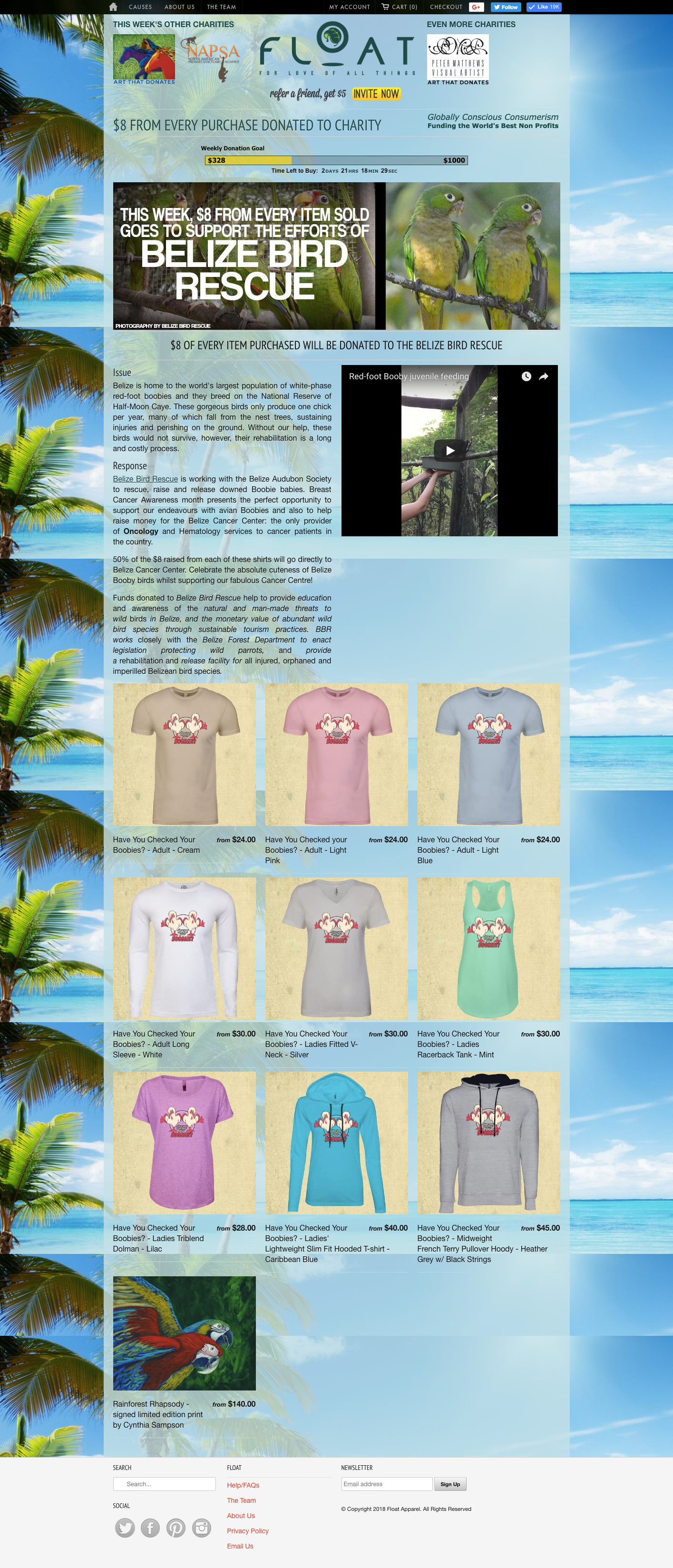
Original Homepage
This is the original homepage for FLOAT.org, for comparison to my redesign.
Usability Redesign
My first redesign consideration was usability. I created a series of wireframes for five main pages and used colored arrows to demonstrate the navigation flow between them.
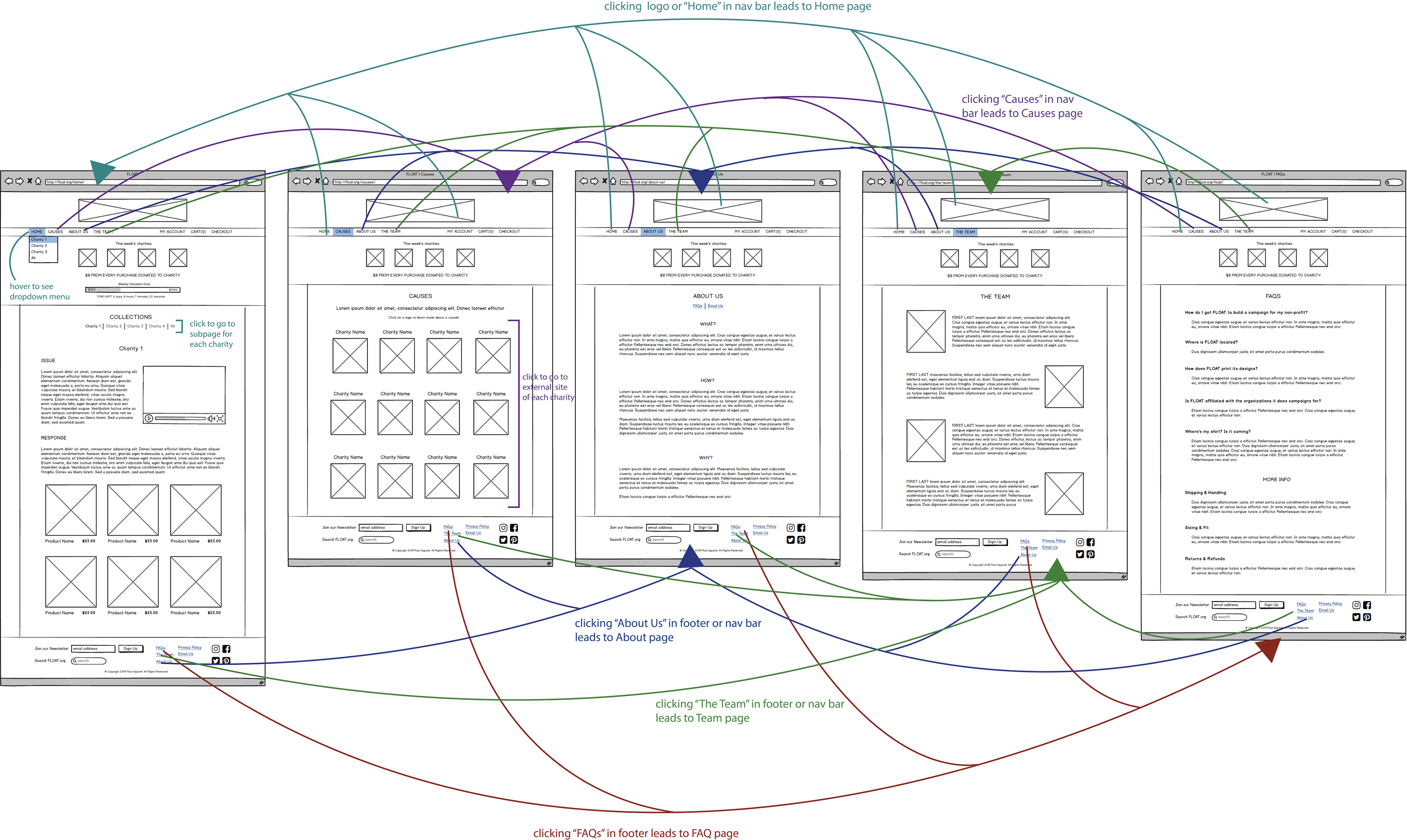
In the original site, clicking on the charity logos located in the header of each page brings you to the product line offered for that organization, but this functionality is extremely unintuitive. I addressed this in my wireframe redesign by adding a dropdown menu to the "Home" button on the navigation bar. This is a more intuitive way to find the different collections. I also relocated the navigation bar to under the logo header, as that is a more prominent and expected place for it.
The original site also made it difficult to look at the full collection of products offered between all the weekly charities. In response, my redesign adds a link menu to the home page that allows greater ease and learnability of switching between collections. I’ve also adds an “All” option to this menu to display all the available products across every collection for the most comprehensive browsing experience.
Finally, my usability redesign removes the general sense of clutter of the original site to result in a cleaner, clearer user experience.
Visual Redesign
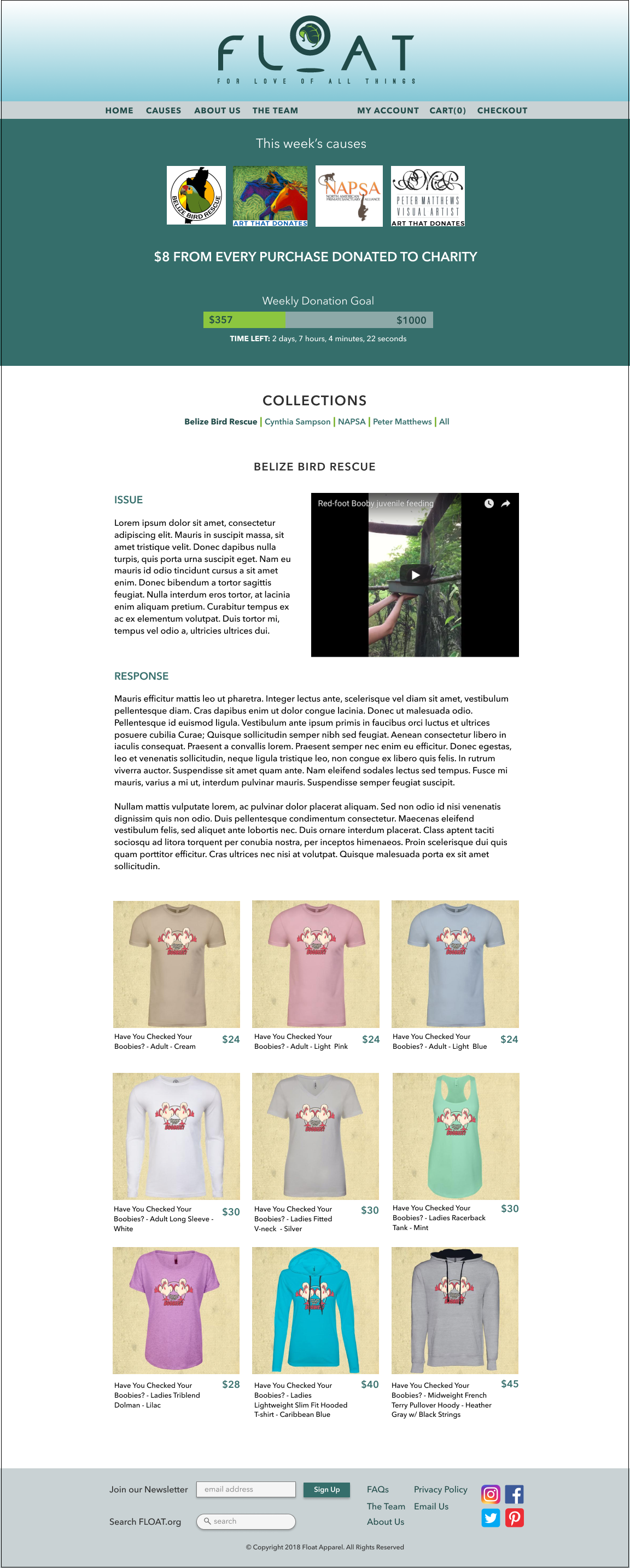
The first thing I did in the visual redesign was choose a new color palette. I began by choosing the dark teal from the logo as my accent color. The other palette colors are additional cool tones that convey the same sense of nature and harmony as the original design and as the company's purpose.


This visual redesign improves readability via multiple changes. I relocated the weekly charity logos to a banner under the navigation bar in order to declutter the header and emphasize the site logo. The color of the progress bar was changed to the bright green for a more unified feel. The body text is aligned on the left instead of justified to reduced odd spacing, and the subtitles are colored, capitalized, and spaced apart to increase contrast and suggest grouping between the two sections. I removed the scrolling image and transparent background color of the original in exchange for more white space, which guides the eye better and looks more professional.
Finally, The footer is rearranged in a more balanced manner, and the social media icons are colored to improve recognizability.
Responsive Redesign
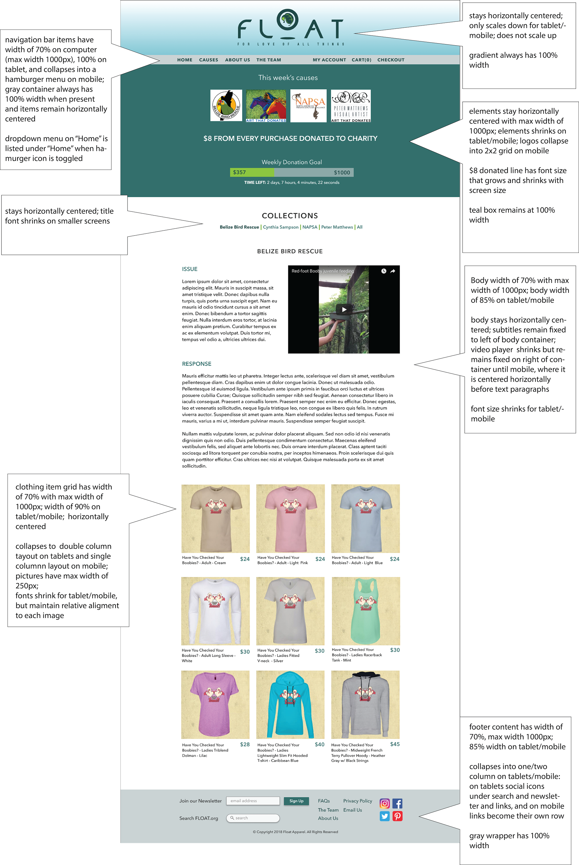
The last component of this redesign was creating a responsive HTML webpage based off of my visual redesign. When making this page responsive, I mostly focused on keeping information contained as efficiently as possible while still being accessible. All of the major content (header, navigation, body, footer) is capped at a maximum width to avoid the appearance of excessively long lines of text on large desktop screens. Background containers are still allowed to stretch to the full width to maintain visual continuity across the entire screen.
On smaller screens, the navigation bar collapses into a dropdown menu toggled by a hamburger icon to preserve limited screen space without compromising readability and usability. Similarly, text elements shrinks to fit the screen more appropriately and charity logos in the teal collapse to increase readability and recognition. The grid of clothing products changes to having two items per row on a tablet and one per row (i.e. single column) on mobile. This is to emphasize the products and keep their details fairly visible, as the goal is to make sales. Finally, the footer collapses on smaller screens to maintain relative scaling, readability, and layout of elements.
Take-Away
Overall, this redesign process taught me the importance of considering how usability, responsiveness, and visual aesthetics interact to create a satisfying user experience. Your visual must be indicative of usability and site should change in expected ways when viewing on different screen sizes. Also, this assignment helped me learn that sometimes less is more!