
Timeframe: 3.5 weeks
Tools: Adobe InDesign, Illustrator, Figma
Tools: Adobe InDesign, Illustrator, Figma
Overview
Ceresti Health is digital health company focused on empowering family caregivers for those living with dementia through a personalized tablet-based program. When a caregiver joins the program, they receive a shipment with their tablet, tablet accessories (charger, headphones, etc.), and a three-ring binder containing supplementary education. This all arrives piled into a standard USPS flat-rate box… not the most professional packaging.
The goal of this project was to improve the overall tablet unboxing experience as well as to use the package assets to clarify tablet functions and simplify the onboarding process for caregivers.
My part in improving packaging consisted of three primary items: redesigning the Caregiver Education Binder that accompanies the tablet, creating a Quick Start Guide to simplify tablet setup, and designing labels to go inside new boxes that were custom made for the tablets.
Caregiver Education Binder
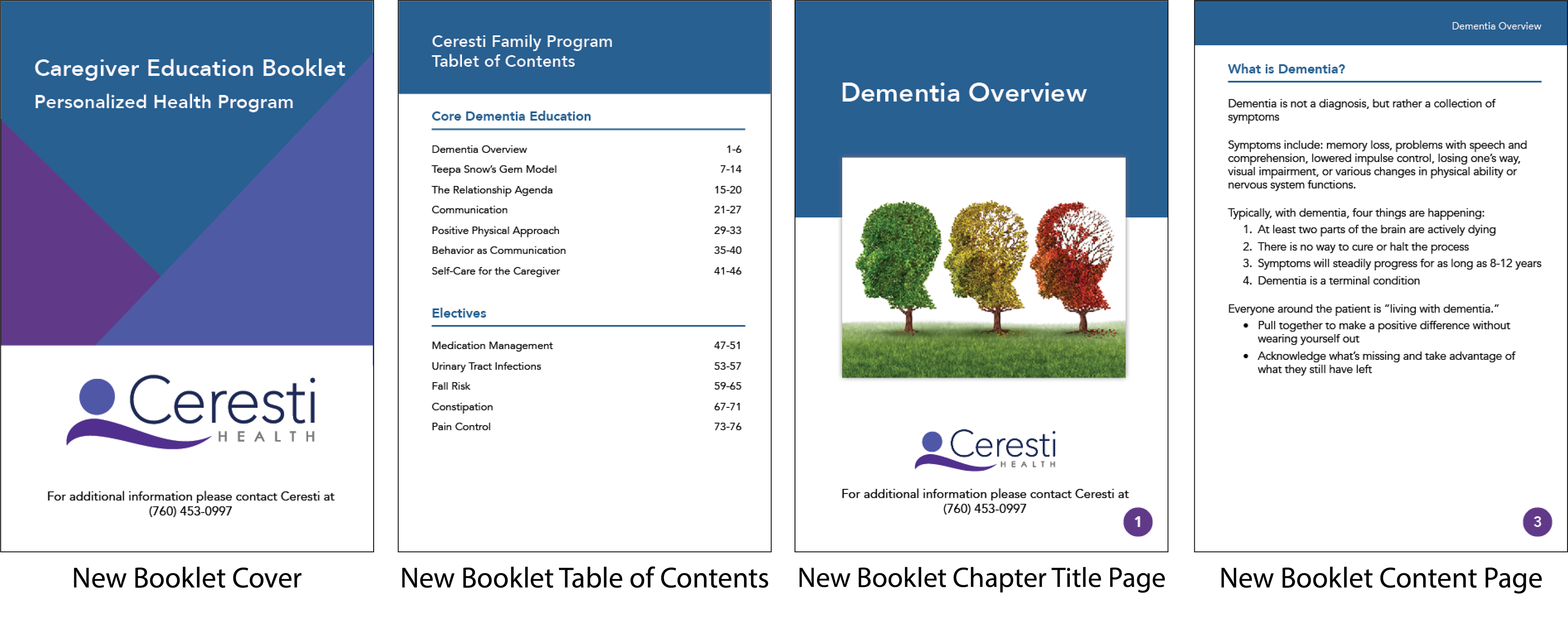
The old Caregiver Education Binder was just that, a binder. The content itself was just printed from a simple text document with no formatting, no color, no design.
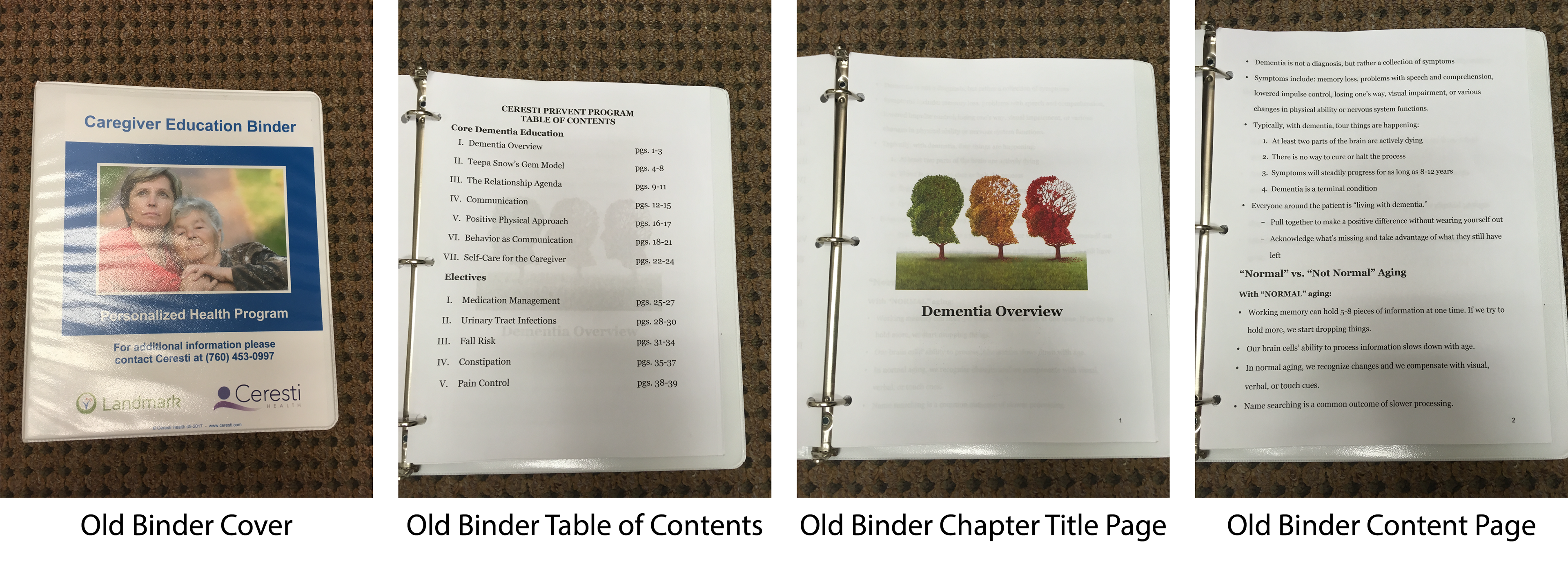
Having such a bland baseline made my job more interesting. I set forth redesigning the binder with a few constraints:
1. We were ditching the three-ring binder for custom printed 9x6” booklets, so I was required to redesign for this new size.
2. Despite the smaller size, I had to maintain a font size large enough for older populations.
3. The content was to remain the same, so I could not alter content to prevent things like awkward page breaks.
Using Adobe Indesign, I created a new booklet with some key improvements. I added running headers to the top of each page (except for chapter title pages). This allows readers to navigate the booklet easier and always know where they are, providing much needed context and guidance for older users.
Another change was the addition of notes pages at the end of each chapter. Designed with extra wide ruled lines (0.4375 inches between lines as opposed to the standard 0.28125 inches) to suit older adults, the notes pages encourage engagement with the education and thus hopefully better retention of the material.
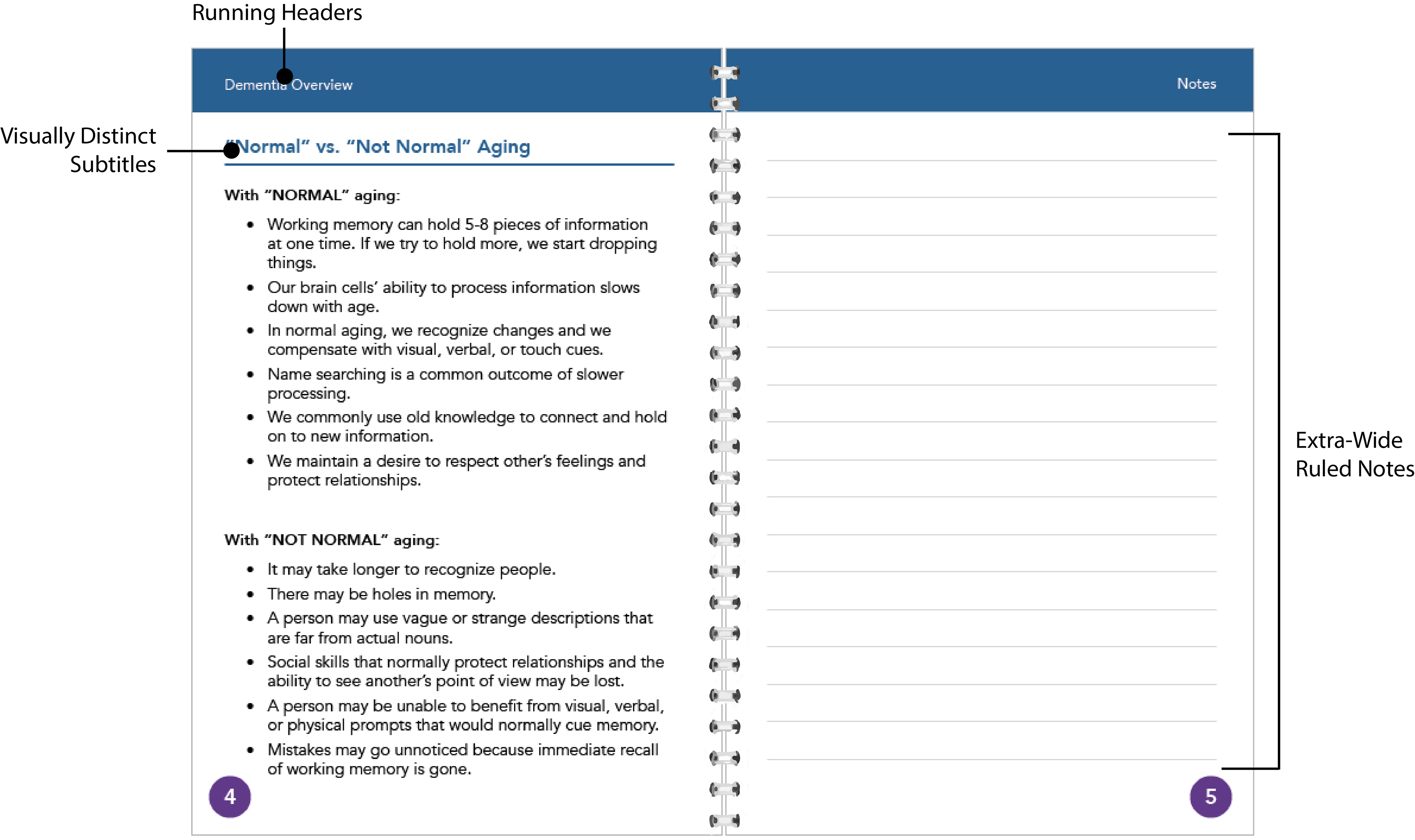
Finally, I introduced distinct subtitles that not only introduce some color, but also provides better visual and cognitive separation of ideas and content.
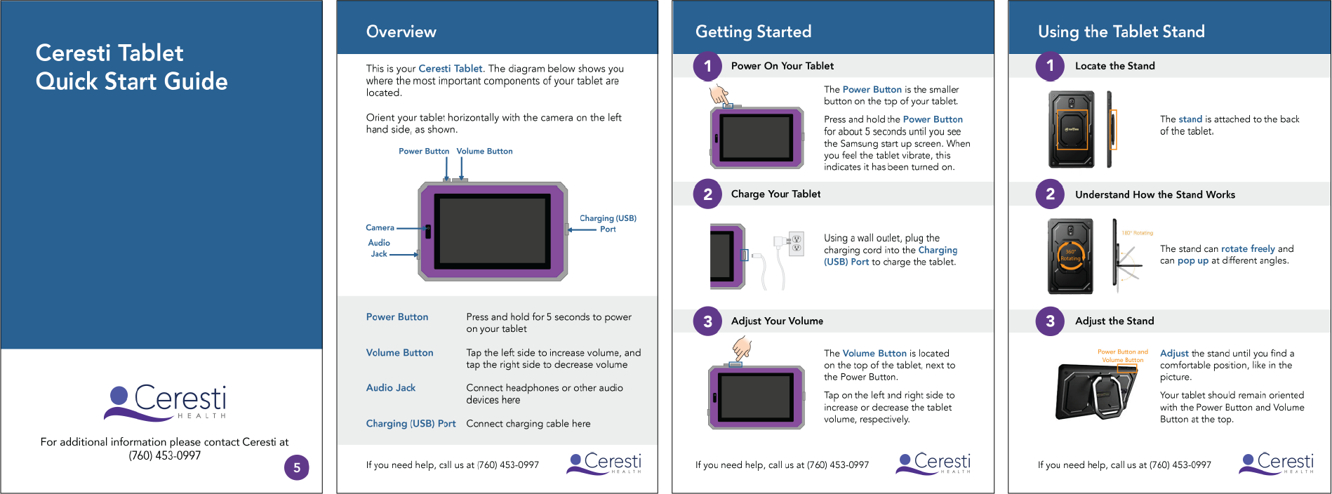
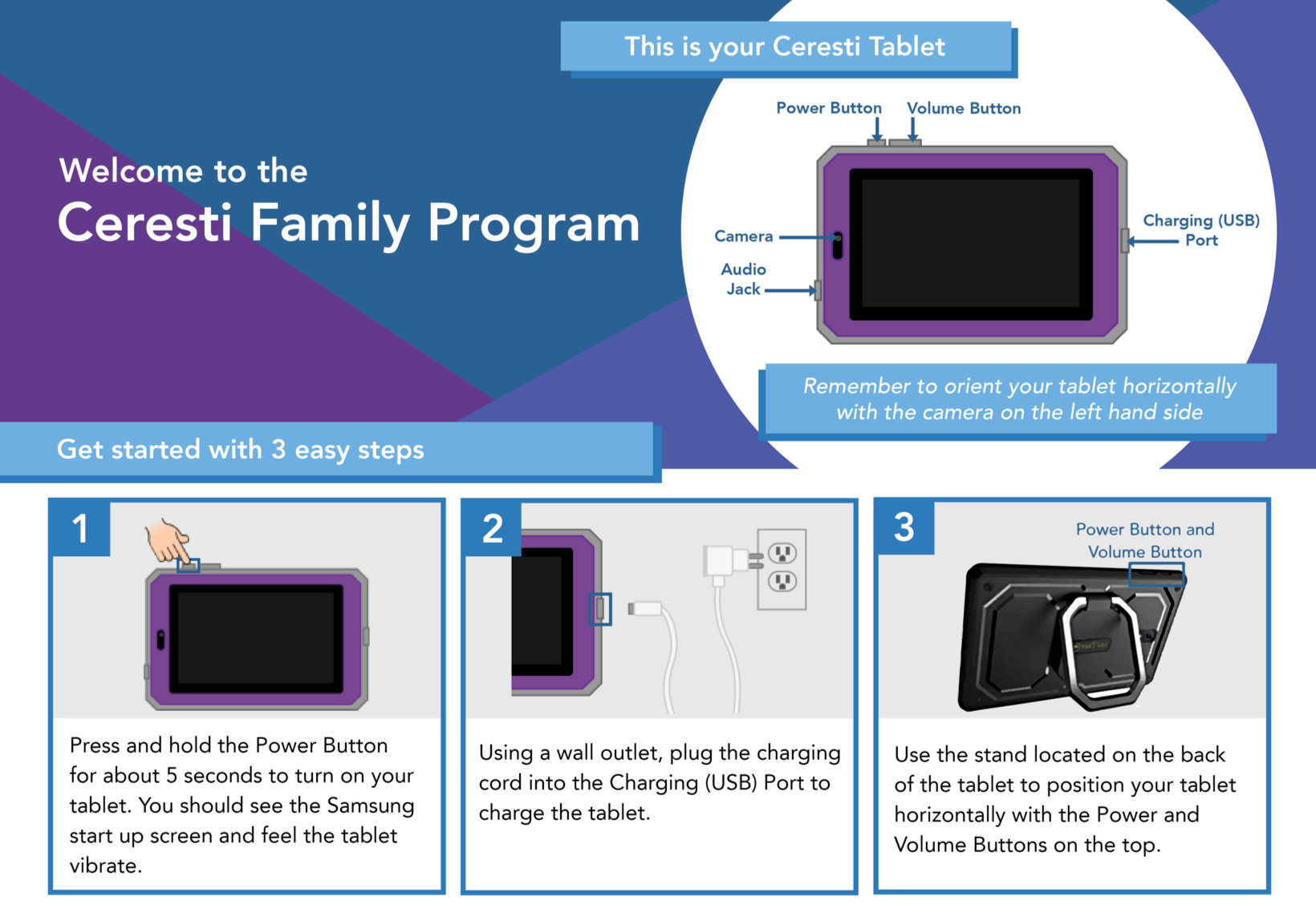
Quick Start Guide
The general process for onboarding a new caregiver requires a call to be scheduled between the caregiver and one of the Ceresti Care Coaches, the individuals who customize caregiver’s programs and provide support along the way. During this call, the Coaches will walk caregivers through every step of the startup process, from turning on their tablet to beginning their program curriculum. This is a time-consuming process that we aimed to simplify by providing a Quick Start Guide to get tablets on, charging, and ready to go.
After receiving a first draft of the Quick Start Guide from a coworker, I got started designing. Using primarily Figma, I mocked up two different layout ideas.
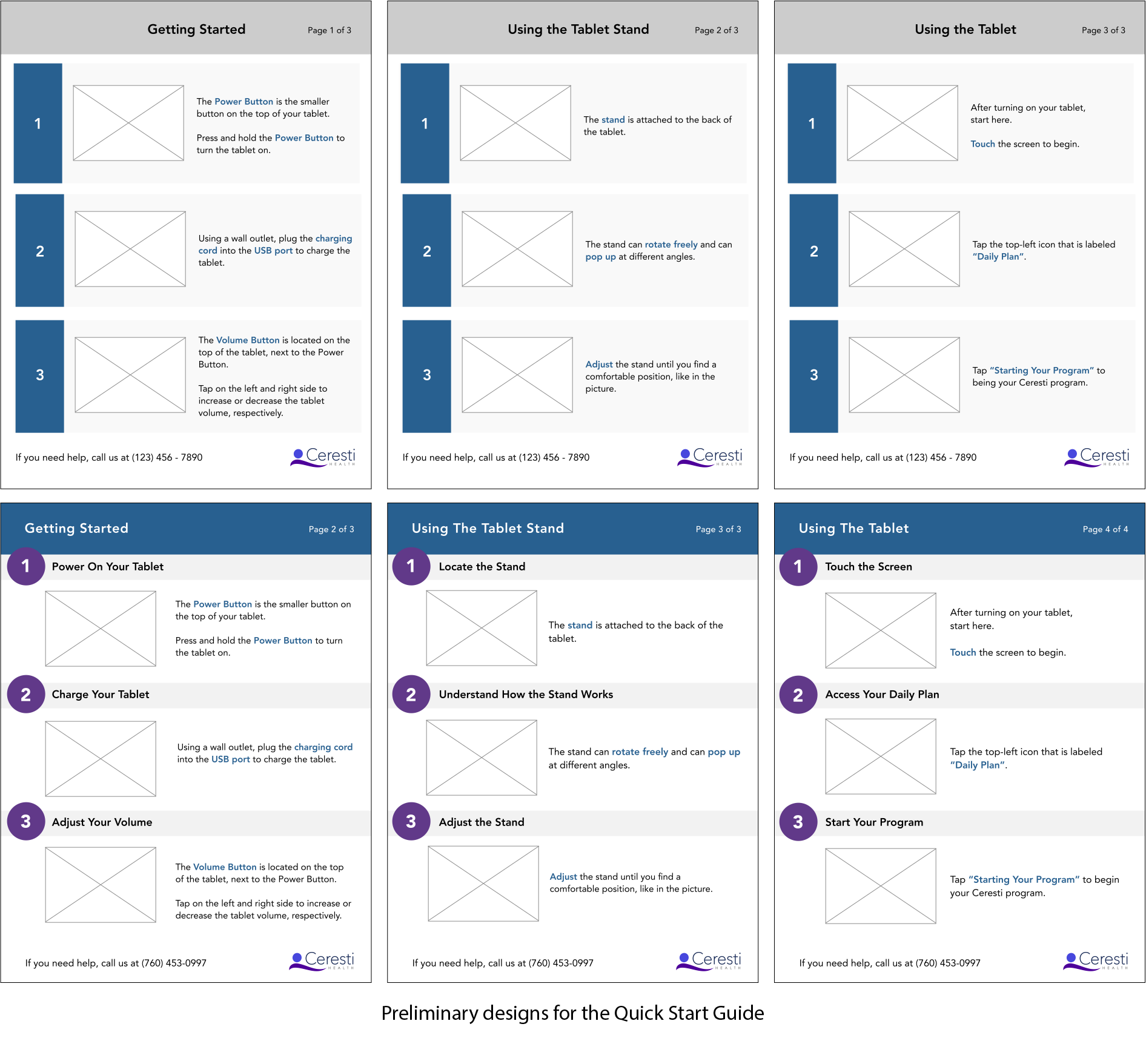
I decided to pursue the design on the bottom because I thought having a title for each instruction step and having the color contrast in both the header and numbers would be more valuable for the user demographic.
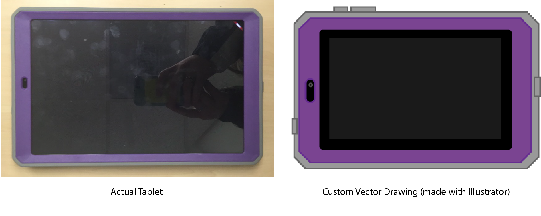
Having decided on a basic layout, I began using Adobe Illustrator to create custom vector drawings of the Ceresti tablets. I decided to make my own images instead of using a generic tablet image in order to make it easier for caregivers to equate the physical tablet in their hands to the images in the guide, and thus reduce obstacles to successfully navigating the tablet. I also exaggerated the scale of buttons for easier identification.
With the content from the first draft of the guide combined with my new layout and images, I proceeded to get feedback from the Coaches. After learning that pressing and holding the power button and knowing which direction to hold the tablet prove to be trouble spots for many users, I decided to add more specificity into the instructions. I also decided to create an Overview page with the important components of the tablet labeled to reinforce the user's understanding of the layout of the tablet.
Initially this Quick Start Guide was intended to be included in the three-ring binder from before. However, with the advent of the new smaller Caregiver Education Booklet, my final task for the new Quick Start Guide was to resize it to be 9x6” so it could be printed in the new booklets.
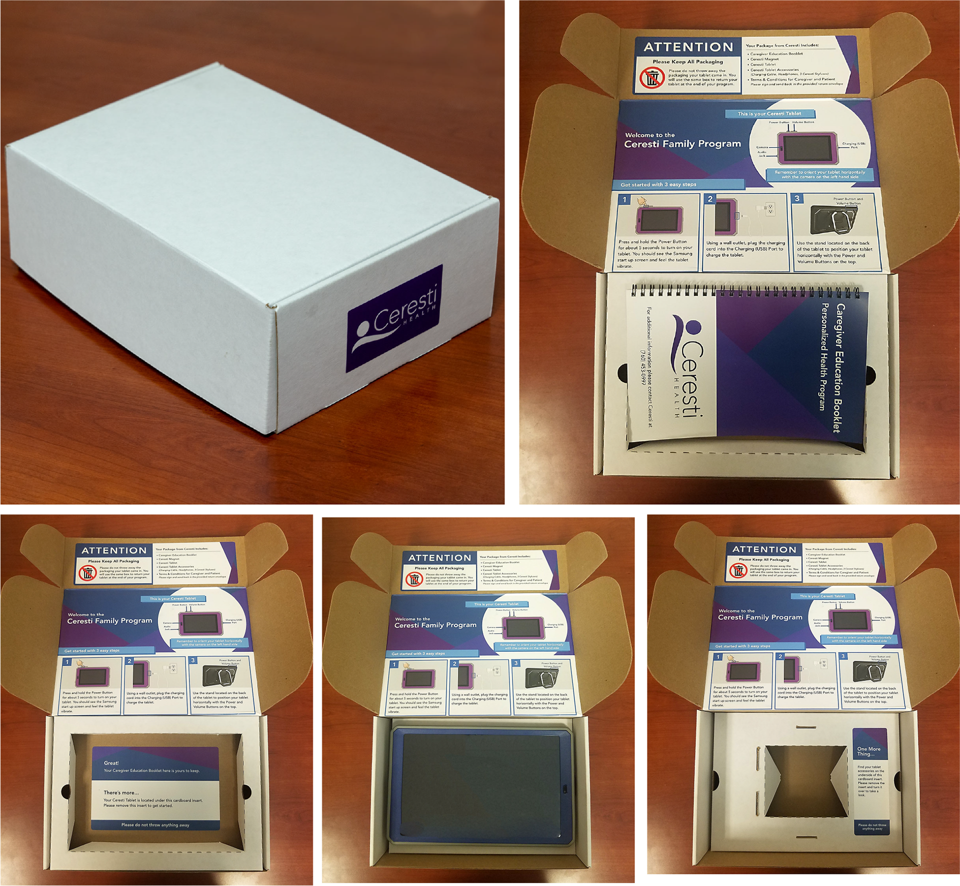
Box Labels
Instead of using standard flat-rate UPS boxes, Ceresti decided to upgrade to boxes that are custom made. Pivoting towards using new custom made boxes introduced the following problems
1. Custom boxes are more expensive than standard boxes, so we want to reuse boxes when possible and thus ask users to not throw the box away.
2. The custom box is layered so that the Education Booklet is nestled in a cardboard insert on top, then the tablet is underneath in a second cardboard insert, then the tablet accessories (charger, headphones, etc.) are underneath that second insert. Thus we need to inform users about the layers so that they do not miss anything.
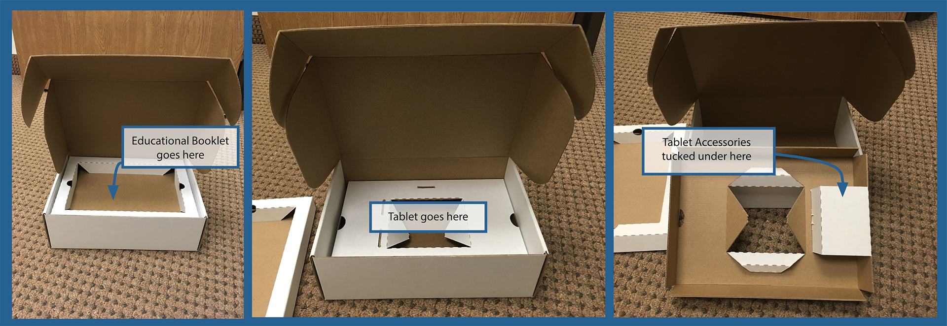
My task here was to create three labels to solve these problems.
The first label to go on the top flap of the box is intended to alert users to not throw the box away, as well as to inform them of the contents of the box.
The second label goes on the first cardboard insert underneath the Education Booklet. This label tells the user to remove the cardboard insert to find their tablet.
The third label is to be placed on the second insert; it alerts the caregiver that the last thing they should find is their tablet accessories under the insert.
These three labels work to gently remind the user not to dispose of packaging as well as to guide them through the unboxing process. I also designed with the potential to print them ourselves in the back of my mind. As such, I made one low-ink printer-friendly version of the labels and another that is more fanciful with larger blocks of color. I designed with the option to DIY the labels because I understand that professionally printing labels can be costly, especially in combination with the custom boxes and printing the new Education Booklets. In the end, we decided to professionally print our labels.
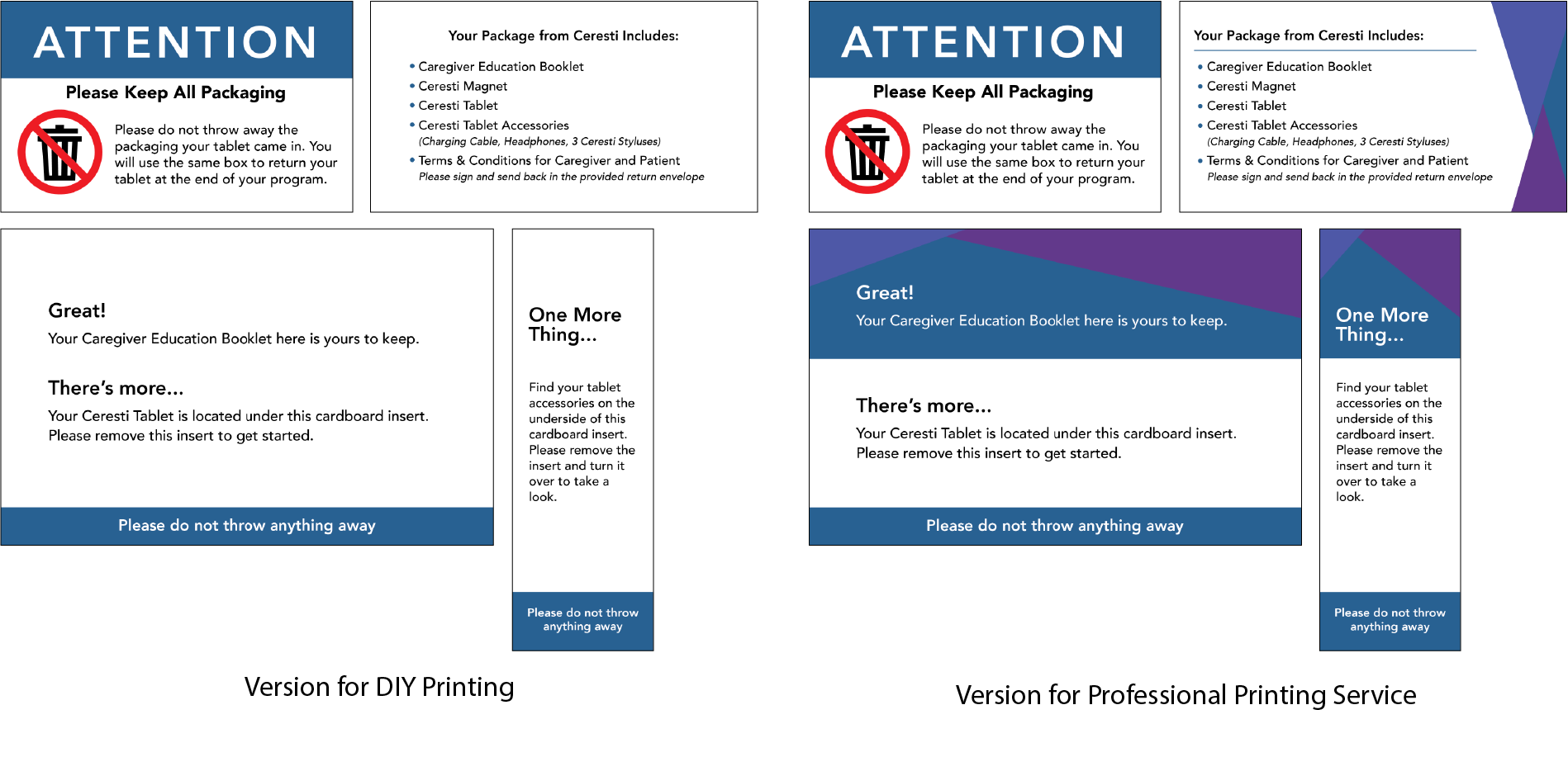
The final sticker I created was a single page version of the Quick Start Guide, affectionately referred to in-house as the Quickest Start Guide. The purpose of this label was to provide information about the tablet in yet another place for users to accelerate their tablet set-ups.
Final Product
With the binder reimagined as the Caregiver Education Booklet, the Quick Start Guide complete, and all of the packaging labels done, my role in this project came to a close.
My general aim for this project was to create consistency across all components of the packaging as well as to create an inviting and accessible user experience across all populations.
What I Learned
Throughout this process, I learned to be sensitive towards a user base that I myself am not part of. I also learned how to create a design pattern with visual motifs and colors and apply that pattern across different components to create unity. This project was also one of my first experiences working entirely with a print-based outcome, rather than a digital once. As such, I learned to print drafts frequently to test color and readability. I also came to understand how design is dynamic and can change when occupying a physical space versus a digital one.