
Timeframe: 3 months
Tools: Figma
Tools: Figma
Overview
Ceresti Health is digital health company focused on empowering family caregivers for those living with dementia through a personalized tablet-based program. Ceresti’s Care Management platform (from now on referred to as CM) is an online website used to manage all of the caregivers and their families who are enrolled in the program. CM is primarily used by the Ceresti Care Coaches, individuals who customize caregiver’s programs and provide support along the way, as a means to track caregivers’ progress and gauge who needs the most attention at any given time.
The old version of CM suffered from poor usability and an unpolished design. It was functional for holding information, but did nothing useful with that information, nothing that would make the Coaches’ jobs easier.
My job as an intern was to essentially create a prototype of the new CM. This was a challenging assignment partially due to just the scope of the project, and partially because the new version of CM needs to be able to do so much more than the old version. By the end of my three month internship, I had created a 50-frame high fidelity prototype of the new CM site to act as a guide for the developers.
Initial Research
In order to understand what the new CM had to look and feel like, I had to first understand what the old CM was like, and where the pain points in its usability were.
I took some time to go through every page of the old CM, making comments about usability and visual design, and also jotting down any questions I would like to ask the Coaches.
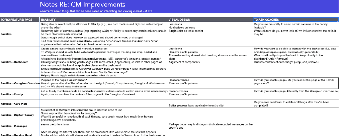
Next, I observed one of the Coaches use CM, which helped to inform the three items that would become our priorities for the new CM:
1. Automation and/or intelligence (i.e. CM should be able to do something useful with the
information it holds)
2. Efficiency of use (reducing the number of steps, introducing more useful interactions
with data)
3. Ability to easily scale up the number of families in CM without scaling up the workload
for Coaches
information it holds)
2. Efficiency of use (reducing the number of steps, introducing more useful interactions
with data)
3. Ability to easily scale up the number of families in CM without scaling up the workload
for Coaches
These three core concepts informed the direction of my designs. They also informed which pages would become our first priorities. The development team, Coaches, and I decided to focus our efforts first on:
1. Triage pages
2. Referral/Lead tracker
3. Care Plan/Workflow improvement
2. Referral/Lead tracker
3. Care Plan/Workflow improvement
Triage Page Development
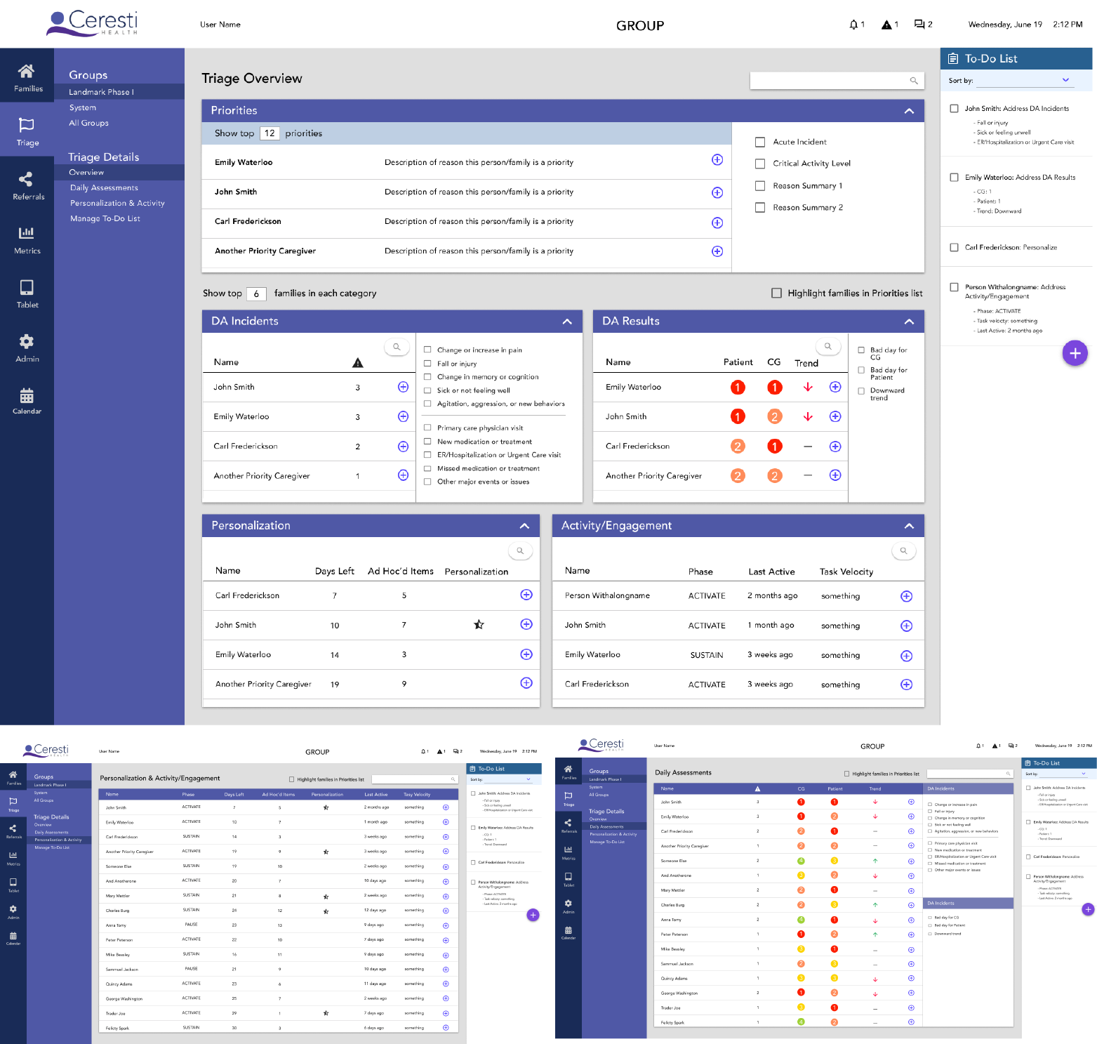
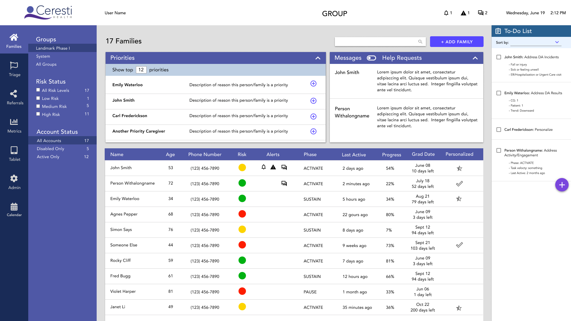
With the old CM, every morning the Coaches start their day by scrolling through a list of all of the families, clicking into a few layers of pages for every family, to determine who needs their attention the most. Thus one of the first improvements we wanted to make was the introduction of Triage pages. These pages will take all of the relevant information about each family and rank them (based on an algorithm informed by the Coaches), outputting a list of the top priorities on any given day.
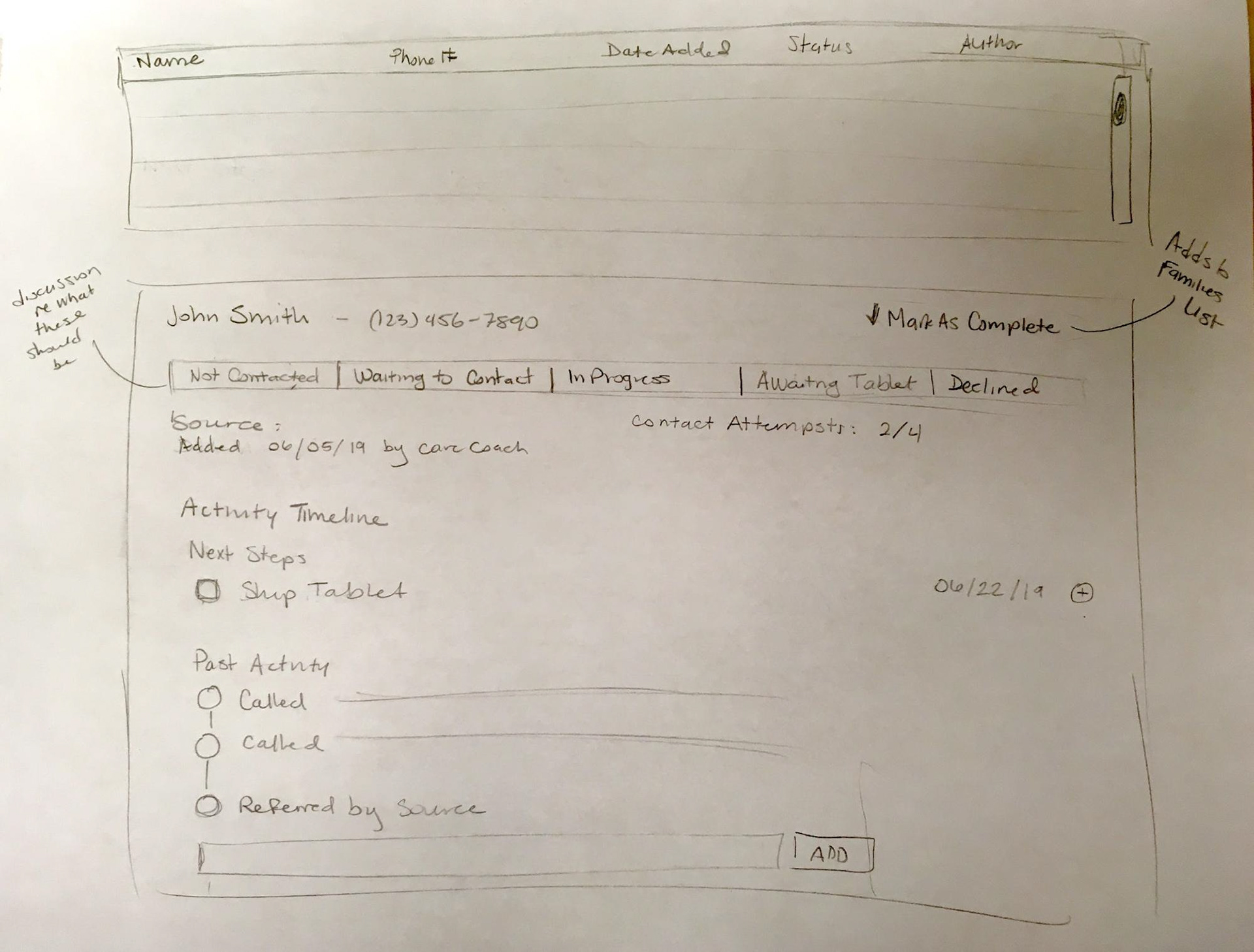
I started as I began every page in this redesign: with sketching and writing down some ideas and requirements. For the Triage pages, I thought it would be useful to see breakdowns of the families in each of the categories that contribute to the top priorities, thus giving the Coaches a greater sense of why certain families are a priority.
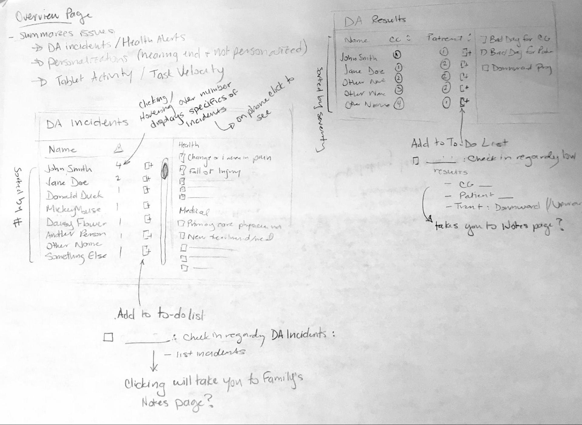
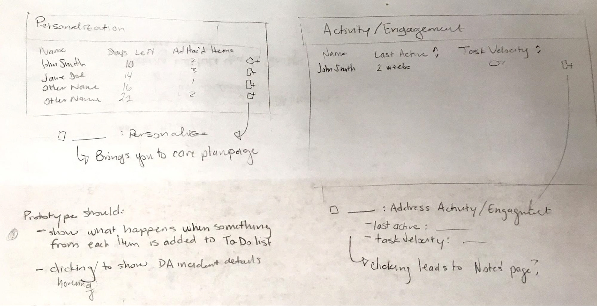
This set of sketches focuses on how to summarize and present relevant information. It also introduces the concept of a to-do list where you can add and track items directly in CM as opposed to using a bunch of sticky notes as Nicole does with old CM.
My next iteration was to create a greyscale mockup of the pages. I opted to create this greyscale version as an intermediate step because it allowed me to focus on layout, content, and usability without getting held up on deciding which colors, specific font sizes, etc. to use.
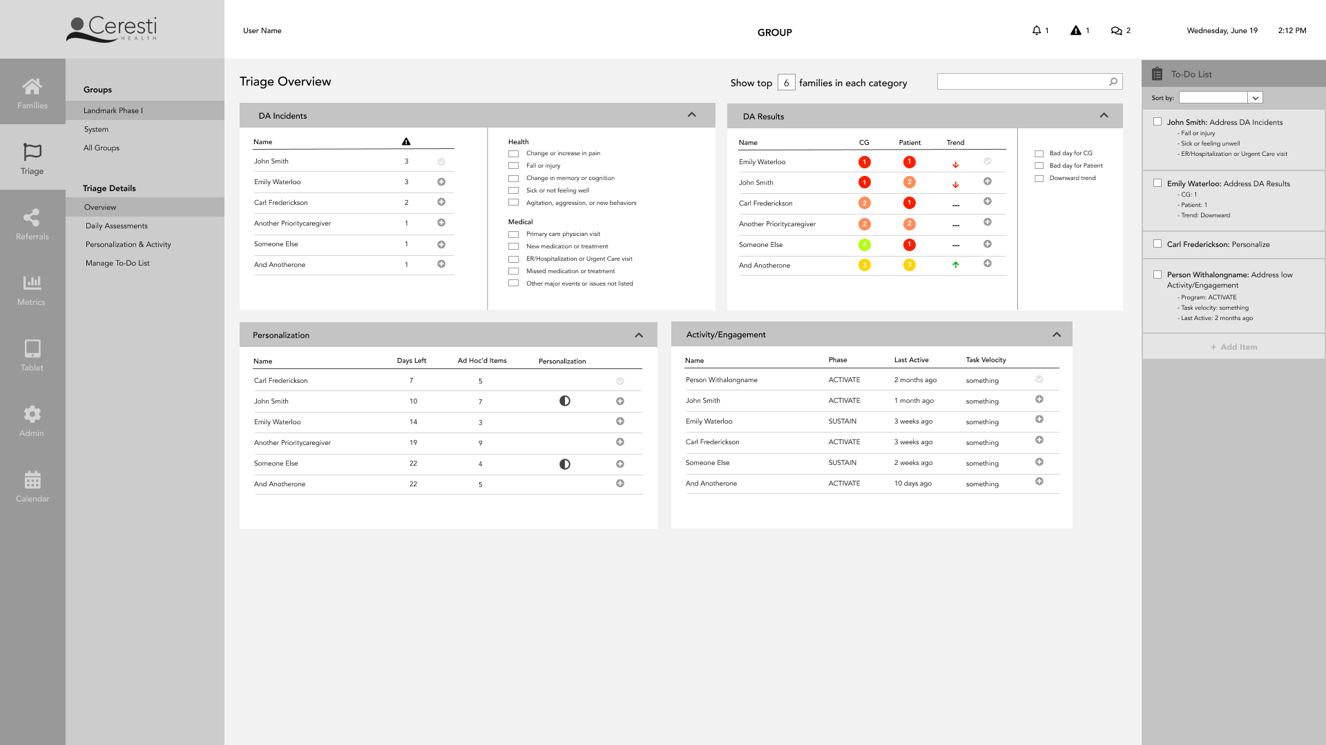
In this iteration, the Top Priorities list was located on the Families list, but in a feedback session, the Coaches requested that list be found here in addition, and that there was some way to see which families are on that Top Priorities list within each of the sublists on the cards. Those revisions led me to the following iteration. Note the option to highlight the families that are in the priorities list for better visual guidance.
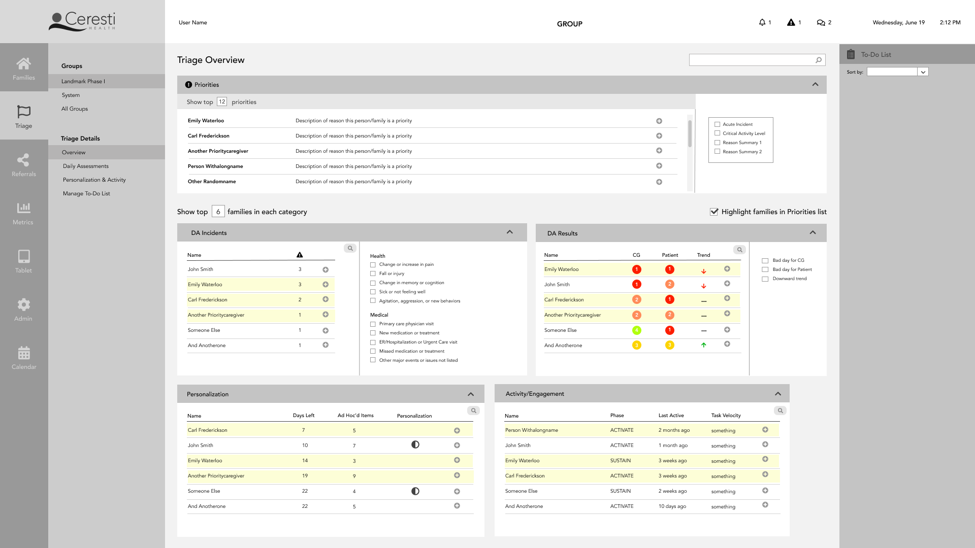
The final step was to render a high-fidelity mockup of the Triage pages in color and using material design standards.
Referral/Lead Tracking Page
The old CM does not have any capabilities to track leads and referrals in any way. The Coaches depend on a single spreadsheet where they write down every action they take with potential families. (I would include a picture but for HIPAA reasons I cannot… just imagine a very messy spreadsheet). Since it is a new feature that is critical to the enrollment process, the referral and lead tracking functionality was important to do earlier rather than later.
I looked at Salesforce for some examples of lead tracking UI.
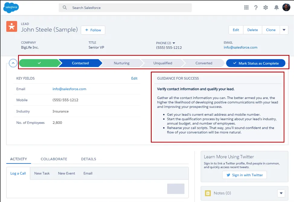
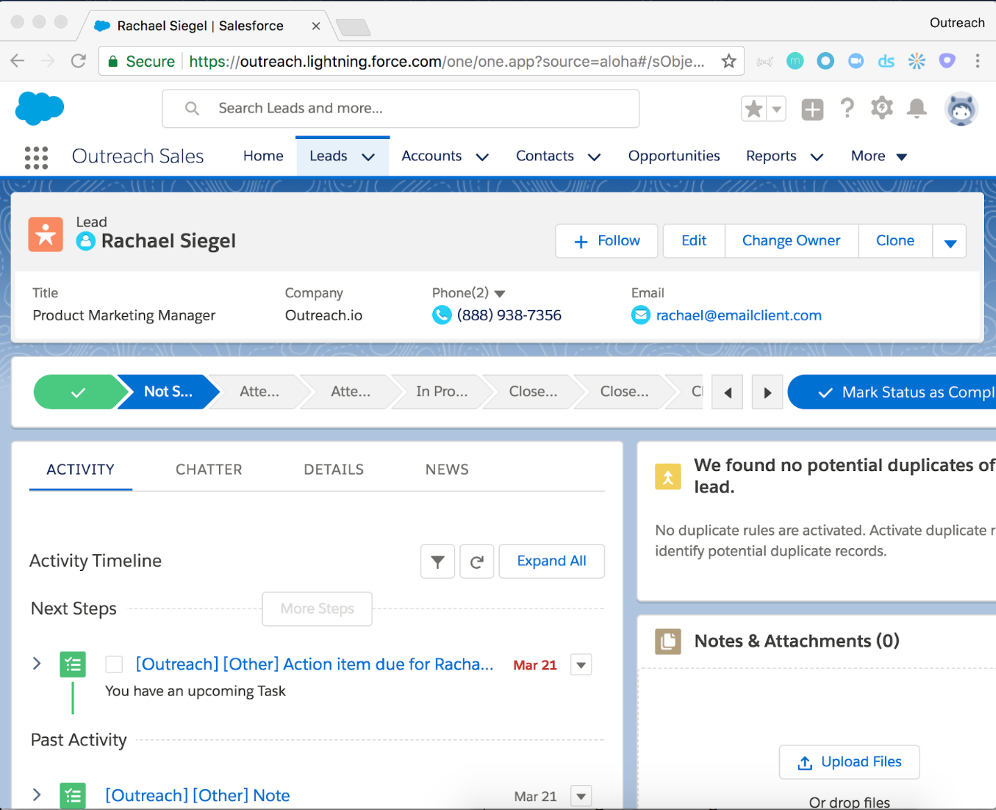
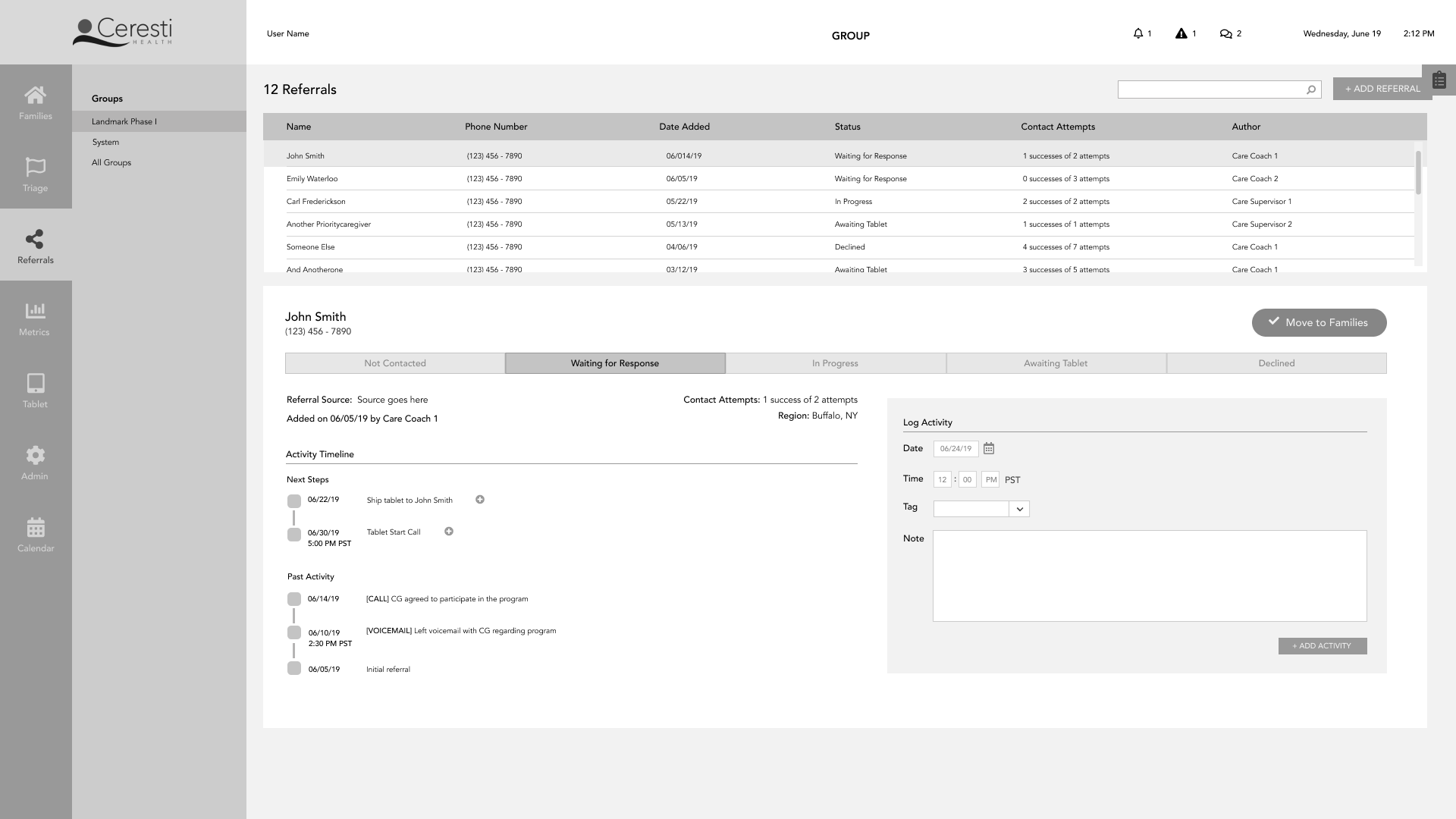
Pulling from the idea of the status bar at the top, and the activity timeline that displays past activity and next steps, I sketched an idea of the CM referrals page.
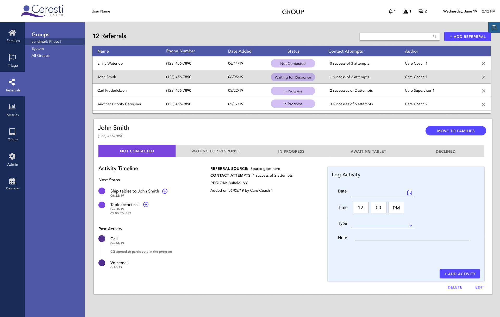
With a clear vision in mind, I developed the black and white medium fidelity prototype, then the high fidelity color mockup.
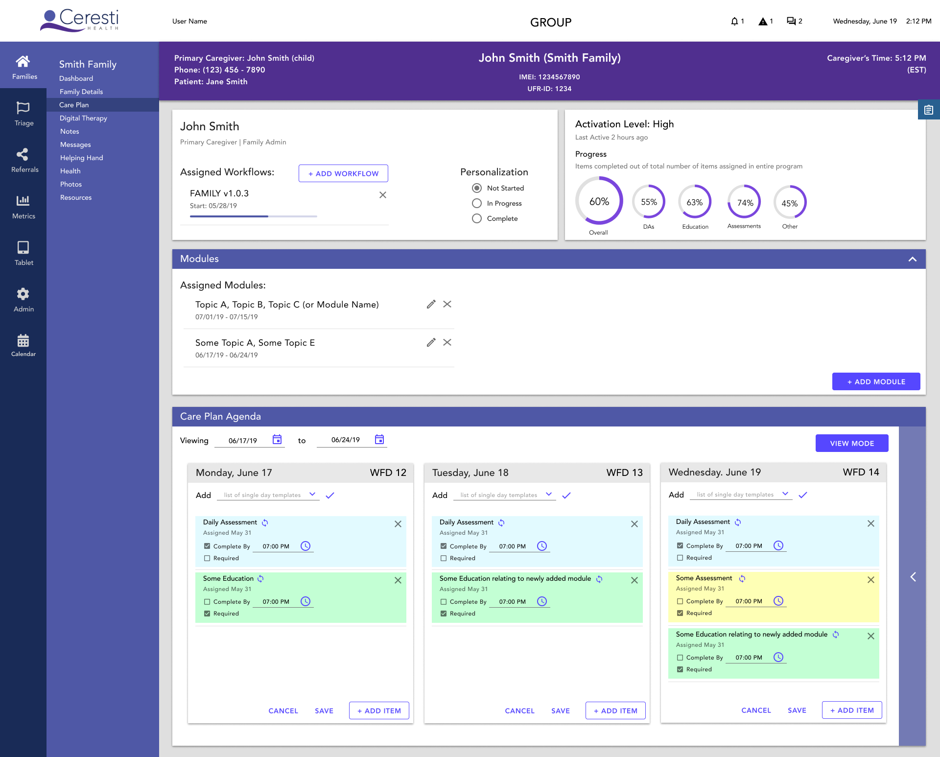
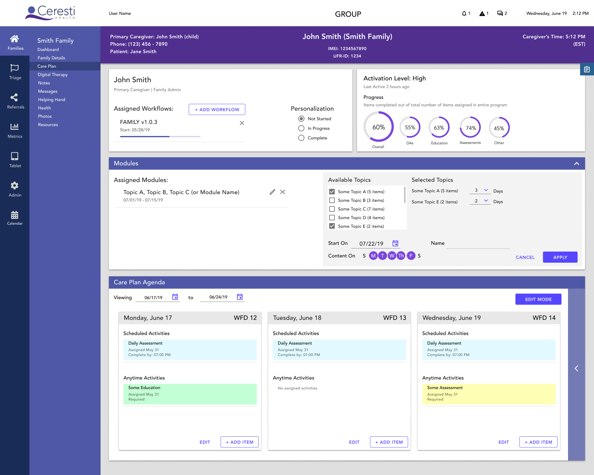
Care Plan/Workflow Improvement
Each caregiver is assigned a Workflow, a specific set of educational modules, social assessments, and other digital content, at the beginning of their program. This, along with any additional education the Coaches add to personalize a program for a caregiver, becomes their Care Plan.
Pictured below if what the old CM Care Plan looks like.
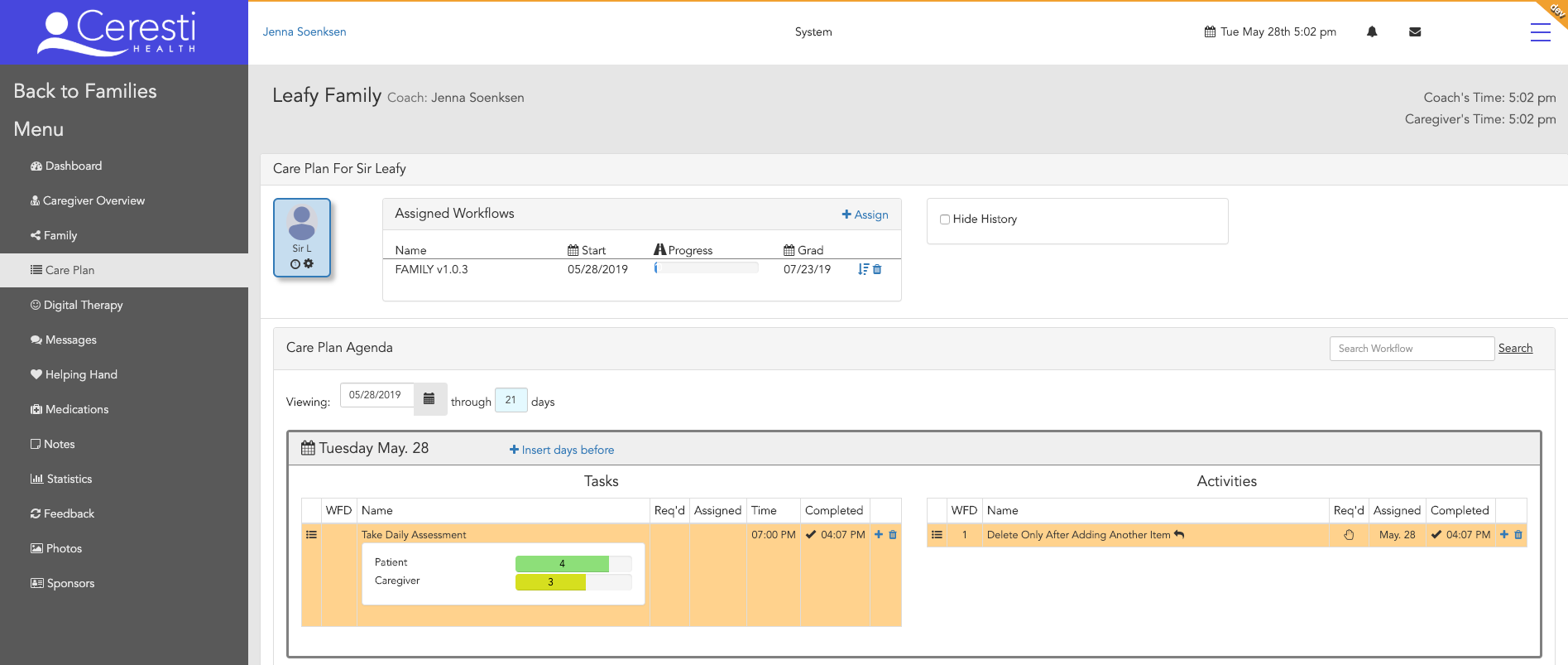
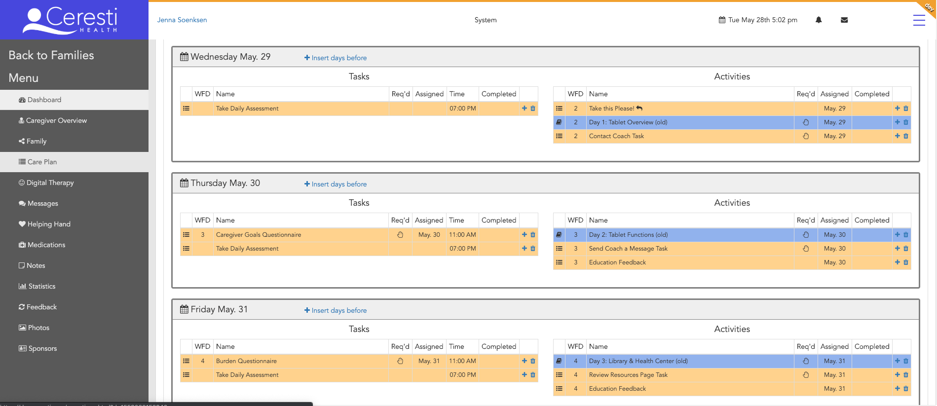
When a Coach is personalizing a program with the old CM, they must individually add every item, and there is no way to edit any item, so if they make a mistake, they must delete it and re-add it. In short, the process of personalizing is time consuming and tedious. My goal with the new Care Plan page was to introduce some interactions that would hasten the process or adding items.
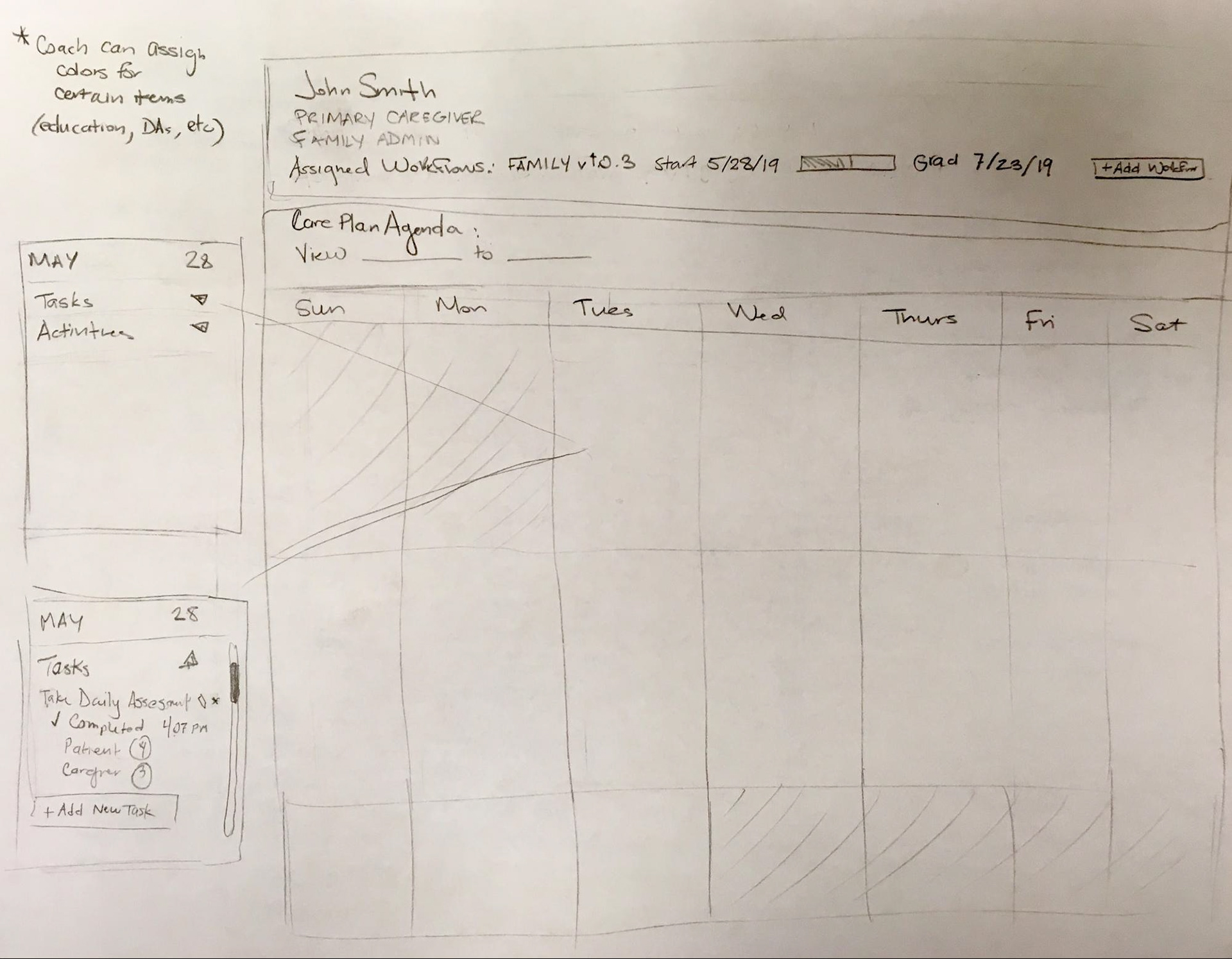
I went through many iterations of sketches for the Care Plan. My first idea was to model the UI into more of a calendar format. However, I quickly realized that this was not the most efficient way to view all of the information when days had a lot of activities.
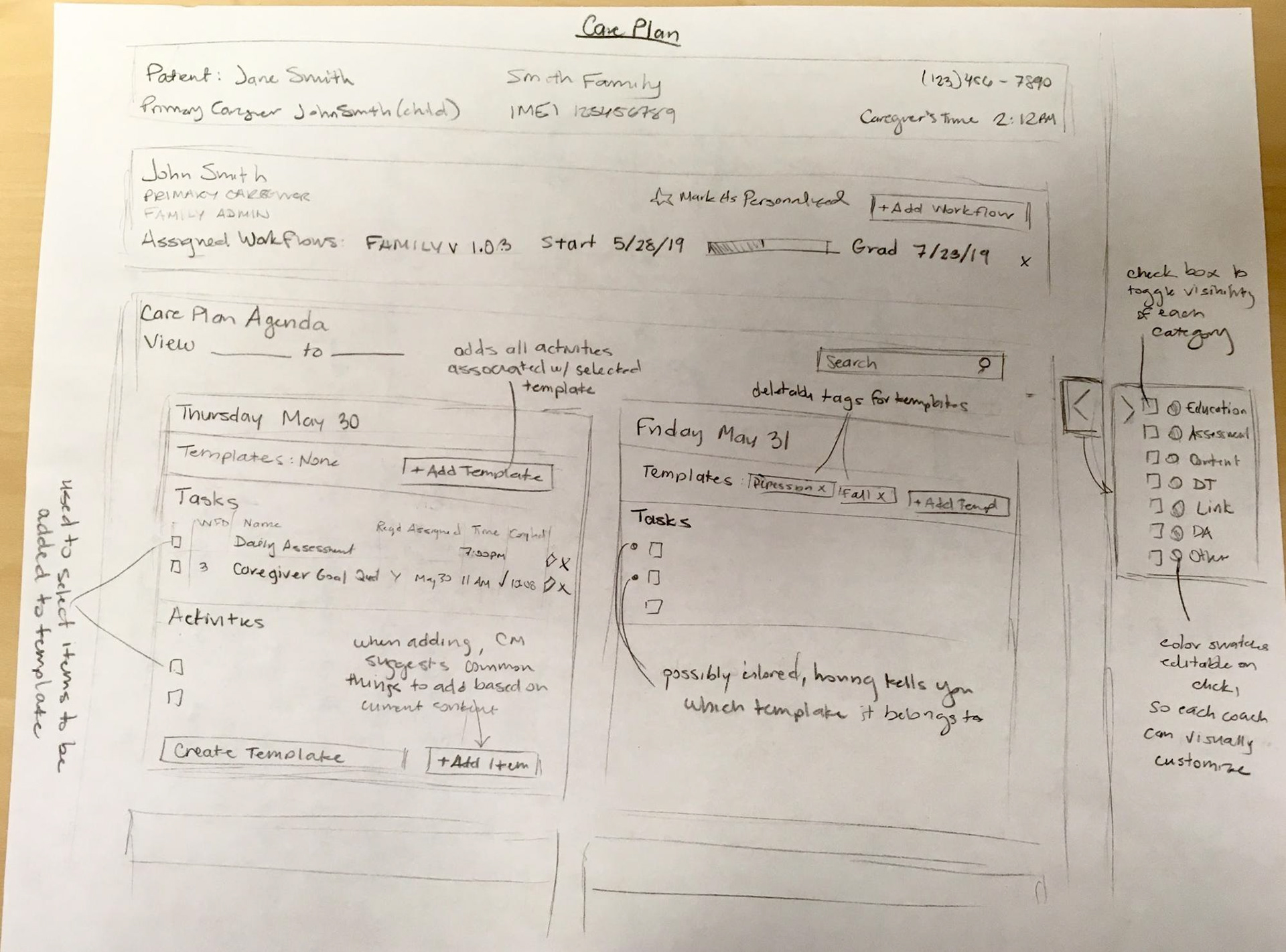
The second sketch iteration on the right had a greater focus on usability and adding new features. I developed the idea of a daily template, where you could save a collection of items together as a template and add a template to a day, thus adding all those items very quickly. This would be useful if a Coach has a collection of items they find themselves assigning frequently across caregivers.
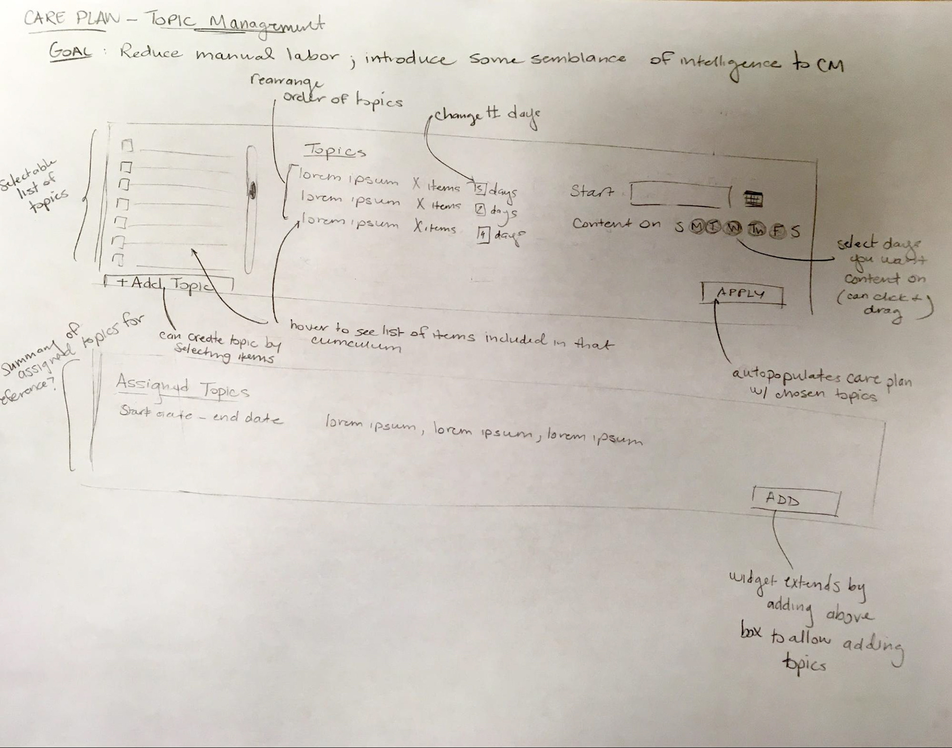
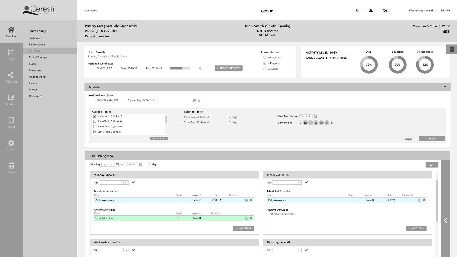
The next set of sketches took the templating idea one step further into what I referred to at first as “topics” and later as “modules.” The goal was to introduce some semblance of intelligence to CM in how it distributes content. The basic idea is you pick topics from a list, with each topic consisting of some related items, then you assign each topic a number of days, choose a start date, and CM does the work of applying the items to the Care Plan.
Along with this concept of topics, I also thought a lot about how to reduce the number of steps in adding items. So I decided to include a list of all the content from which you can drag and drop any number of items onto any day or create a template. I also envision the ability to drag items from any day onto any other day, and thus be able to directly and intuitively manipulate Care Plans.
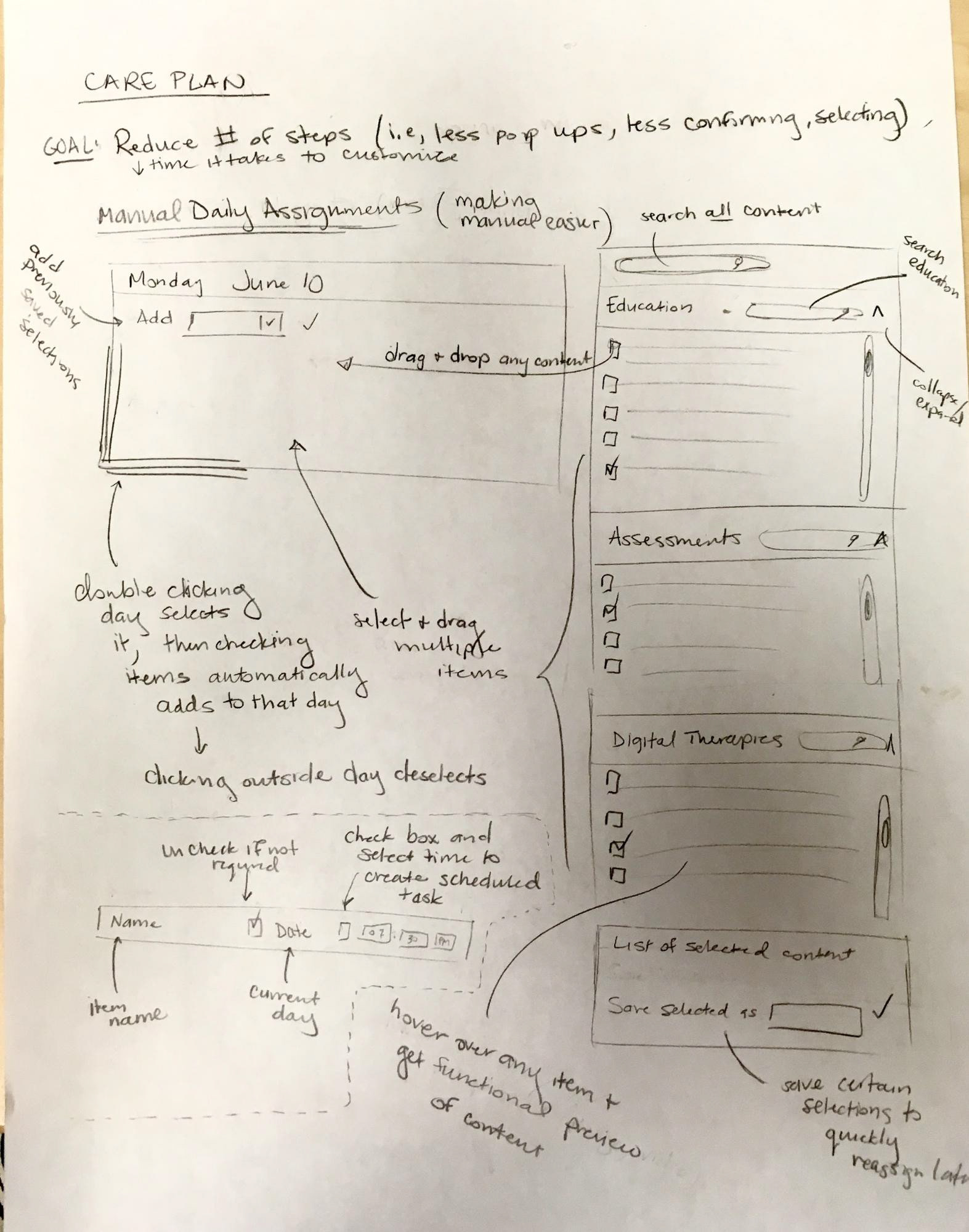
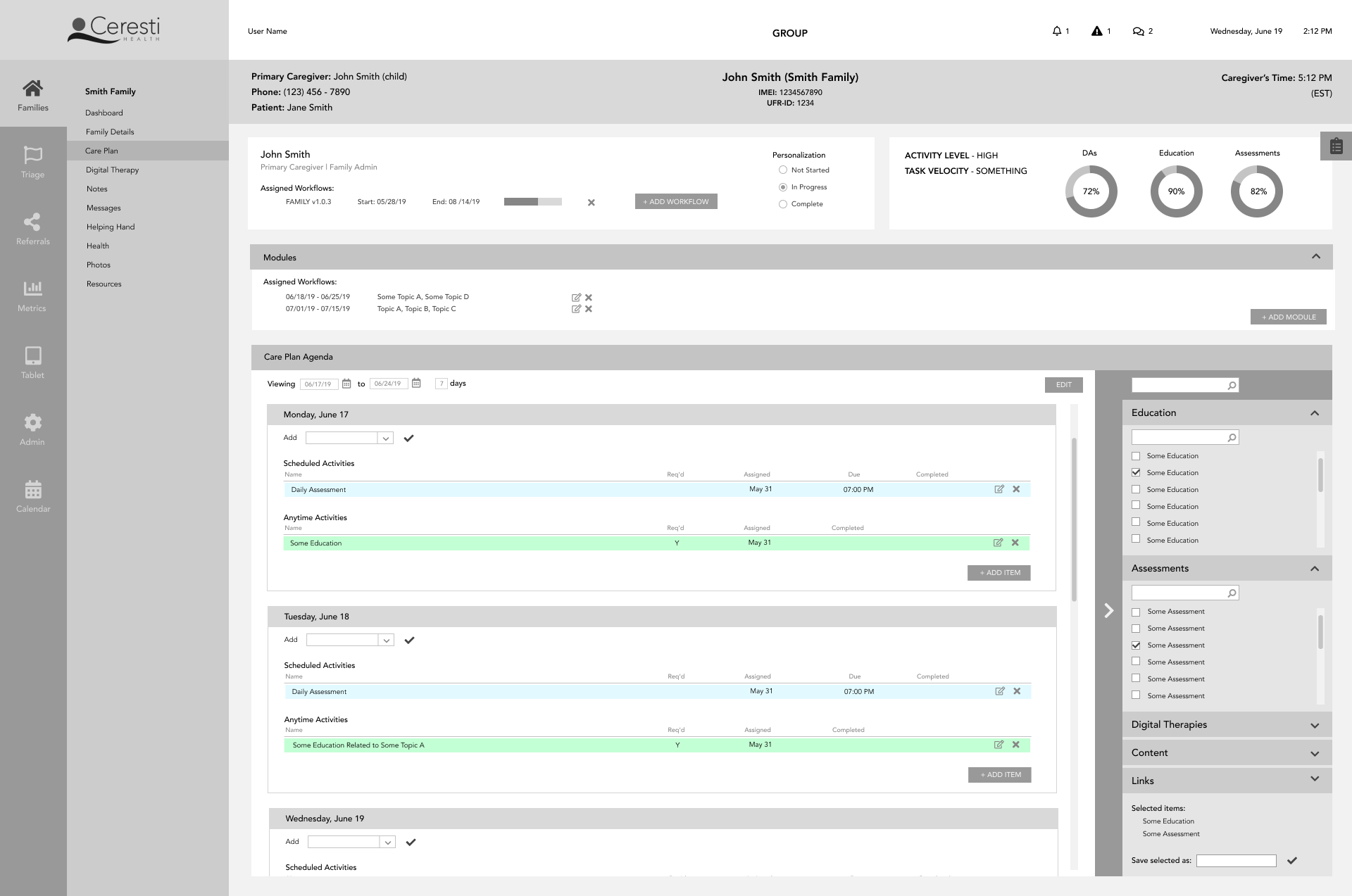
Here are those components incorporated into the black and white prototype:
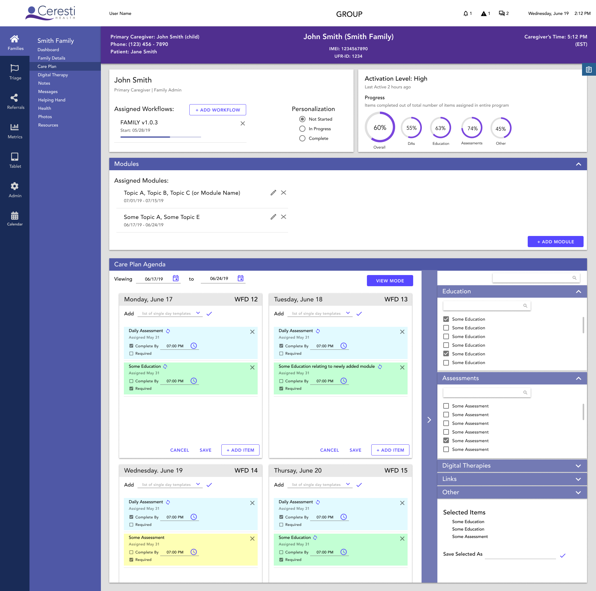
For the high-fidelity prototype, I gave some more thought to how activities will be edited, and created an “edit mode” for clean and consistent editing across the entire Care Plan
Other Improvements
Throughout this process I generally focused on improving efficiency and usability, and the visual improvements followed naturally. For the sake of brevity, here a few more pages with major usability upgrades.
Families List
Major changes:
- Adding Priorities List with for easy evaluation of who needs attention; also addition of the
“+” button which automatically adds a task to the to-do list
- Increasing the visibility of unread messages and help requests by adding a card
- Updating the information in the list of families to be more helpful (like including whether a
family has been personalized or not)
Old Family List
Redesigned Family List
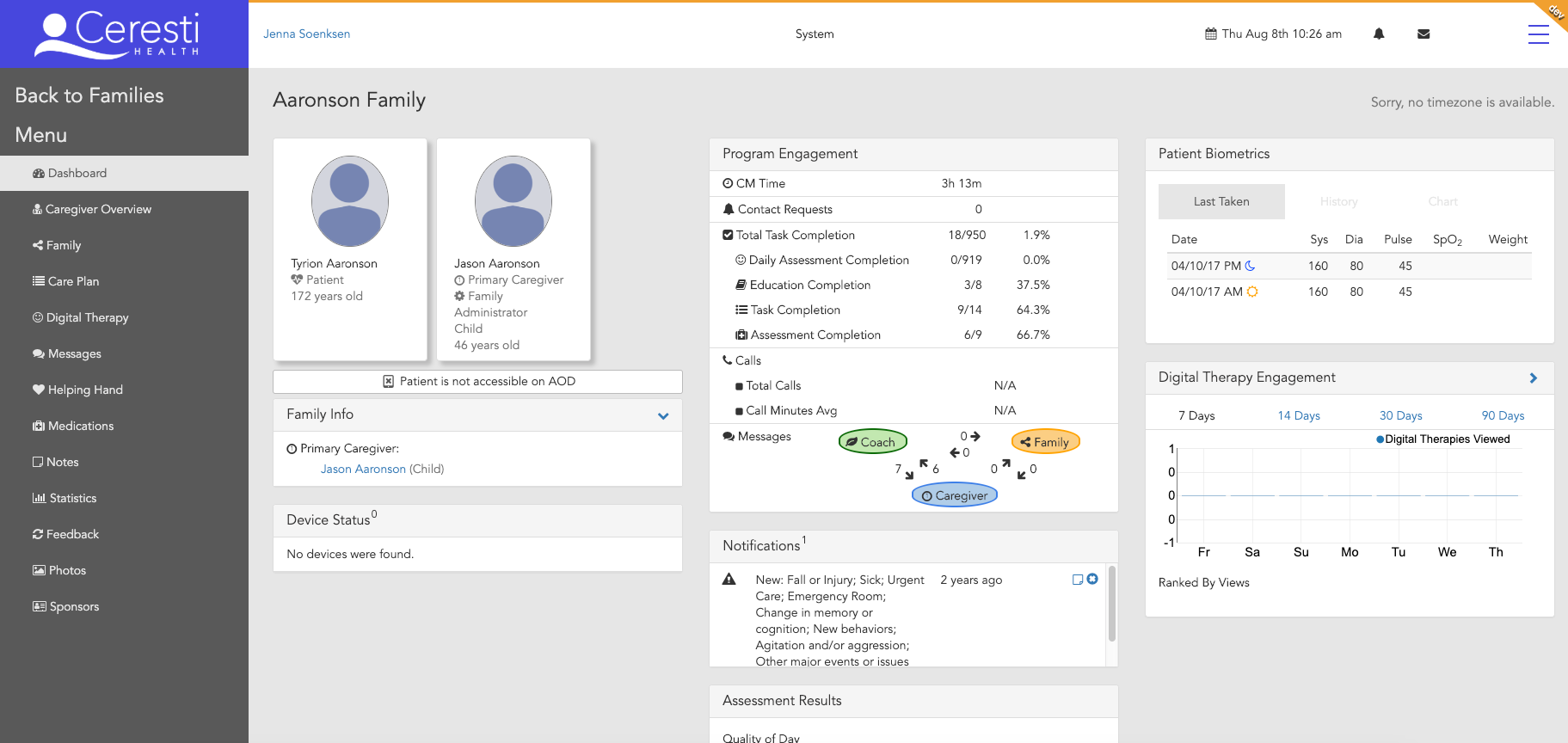
Dashboard
Major changes include:
- Cards collapse and expand and the dashboard can be customized by rearranging,
removing, or adding cards
- Content is significantly more relevant to what the Coaches care about and use to gauge a
caregiver’s need
- There is a banner with important family information that is on every family page so a
Coach can quickly find important information like caregiver and patient names
- There is a flag that indicates when a family is on the Top Priorities list so Coaches are
always aware
Old Dashboard
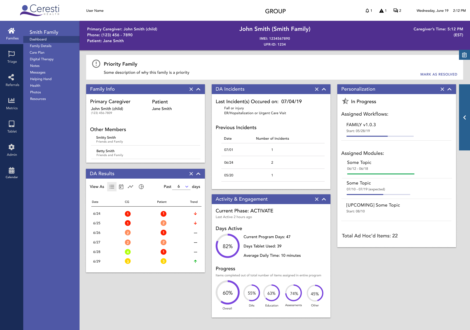
Redesigned Dashboard
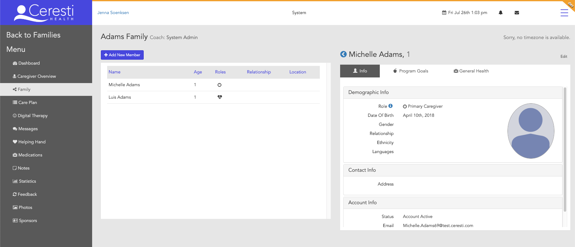
Family Page
Major changes:
- Combined the original Caregiver Overview and Family pages into a single Family Details
page, because they had repetitive information
- Introduced a similar usability pattern as in the Dashboard to modularly add information
about family members
- Able to add certain information based on what kind of role (caregiver, patient, friends and
family) a member is
Old Family page
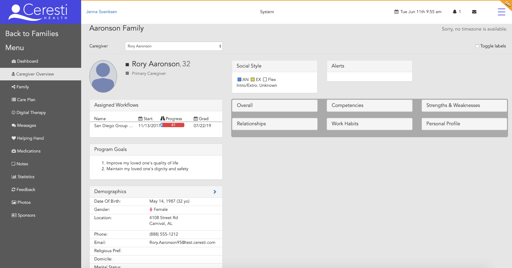
Old Caregiver Overview page
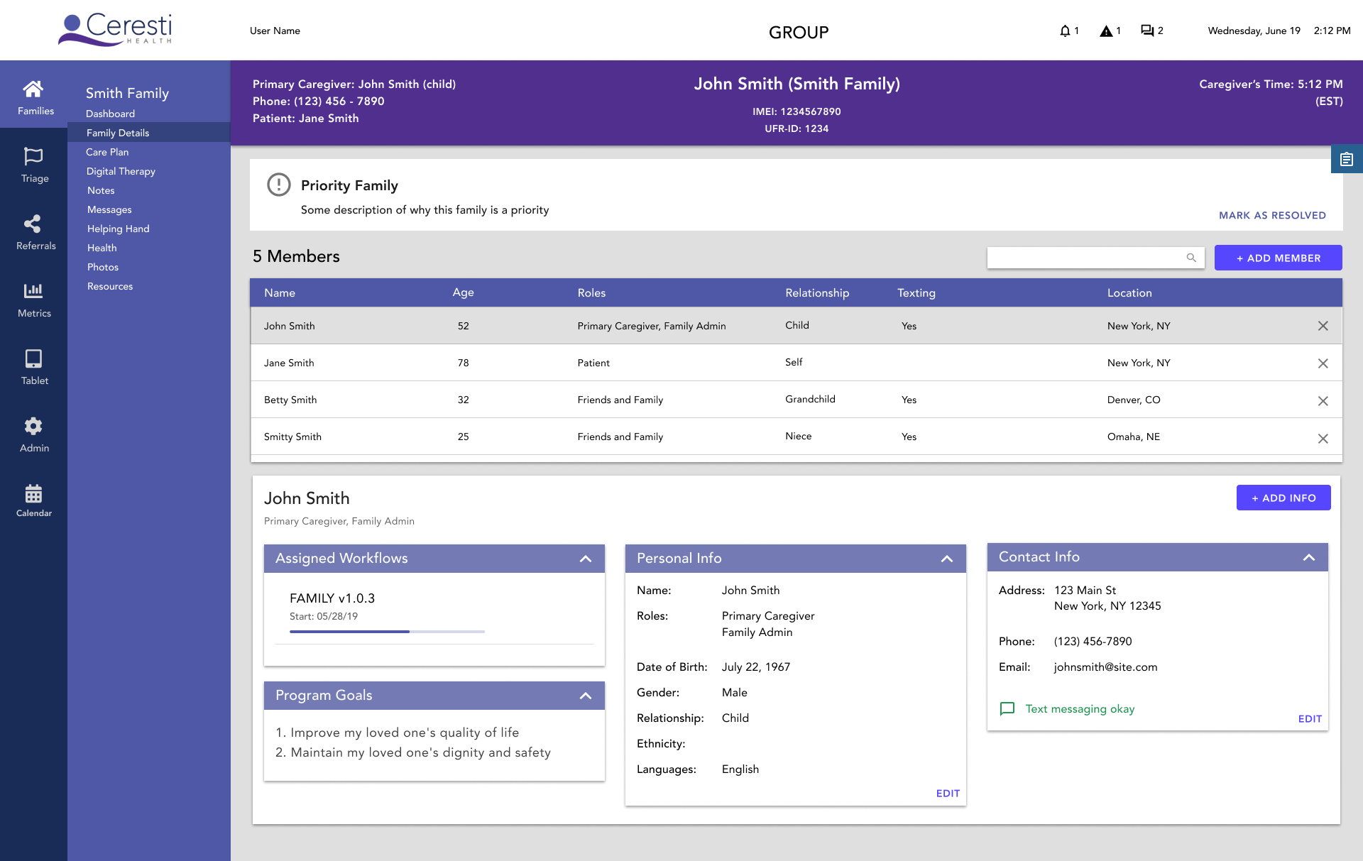
Redesigned Family Info Page
What I Learned
Sometimes users truly don’t know what they want
It’s easy to get overwhelmed with large projects
Not everyone thinks the way I do. That is, sometimes users and stakeholders will suggest things that I might personally disagree with. The job of a good designer is compromise and find the cause of the problems and solve from there.
It seems obvious, but it’s helpful to know design constraints/paradigms beforehand. I didn't know I was supposed to follow material design standards until two weeks before the end of my internship.